Bulk RNA-seq 可视化#
本节介绍 omicverse 中适用于 bulk RNA-seq 分析的常用绘图方法。
import os
import warnings

warnings.filterwarnings("ignore", "Importing read_loom.*", FutureWarning)

import numpy as np
import pandas as pd
import omicverse as ov
import scanpy as sc
import matplotlib.pyplot as plt
from anndata import AnnData

os.makedirs("figures", exist_ok=True)
ov.plot_set()
🔬 Starting plot initialization...
🧬 Detecting GPU devices…
✅ Apple Silicon MPS detected
    • [MPS] Apple Silicon GPU - Metal Performance Shaders available

   ____            _     _    __
  / __ \____ ___  (_)___| |  / /__  _____________
 / / / / __ `__ \/ / ___/ | / / _ \/ ___/ ___/ _ \
/ /_/ / / / / / / / /__ | |/ /  __/ /  (__  )  __/
\____/_/ /_/ /_/_/\___/ |___/\___/_/  /____/\___/

🔖 Version: 2.2.1rc1   📚 Tutorials: https://omicverse.readthedocs.io/
✅ plot_set complete.
维恩图#
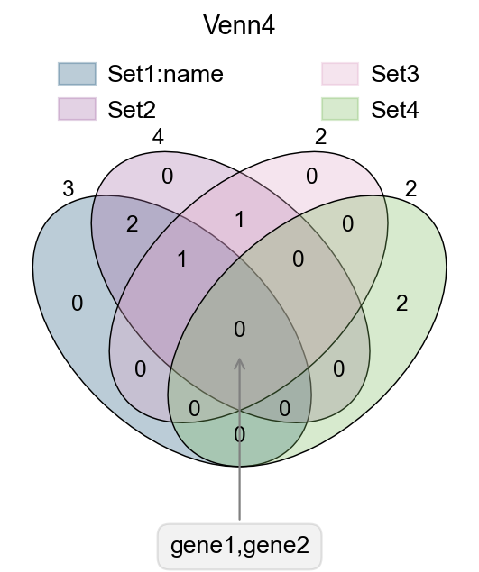
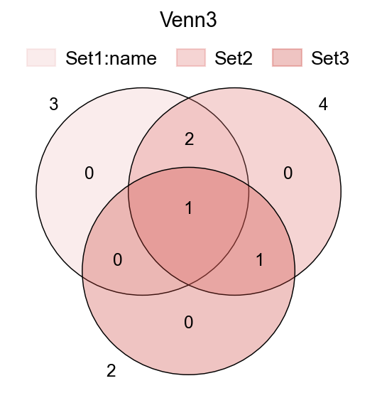
在转录组分析中,我们经常需要比较不同分组共有或特异的差异基因。ov.pl.venn 可用于绘制维恩图,直观展示 2 到 4 个集合之间的重叠关系。
Function: ov.pl.venn:
sets: 需要绘制的集合,使用字典格式,键的数量不超过 4 个。palette: 可自定义颜色,例如palette=["#FFFFFF", "#000000"];OmicVerse 也提供了ov.pl.red_color、ov.pl.blue_color、ov.pl.green_color、ov.pl.orange_color等预设色板。fontsize: 图中文字和线宽的缩放参数,实际字体会在此基础上进行放大。
fig,ax=plt.subplots(figsize = (4,4))
#dict of sets
sets = {
    'Set1:name': {1,2,3},
    'Set2': {1,2,3,4},
    'Set3': {3,4},
    'Set4': {5,6}
}
#plot venn
ov.pl.venn(sets=sets,palette=ov.pl.sc_color,
           fontsize=5.5,ax=ax,
           )


#If we need to annotate genes, we can use plt.annotate for this purpose,
#we need to modify the text content, xy and xytext parameters.
plt.annotate('gene1,gene2', xy=(50,30), xytext=(0,-100),
             ha='center', textcoords='offset points',
             bbox=dict(boxstyle='round,pad=0.5', fc='gray', alpha=0.1),
             arrowprops=dict(arrowstyle='->', color='gray'),size=12)

#Set the title
plt.title('Venn4',fontsize=13)

#save figure
fig.savefig("figures/bulk_venn4.png",dpi=300,bbox_inches = 'tight')
fig,ax=plt.subplots(figsize = (4,4))
#dict of sets
sets = {
    'Set1:name': {1,2,3},
    'Set2': {1,2,3,4},
    'Set3': {3,4},
}

ov.pl.venn(sets=sets,ax=ax,fontsize=5.5,
           palette=ov.pl.red_color)

plt.title('Venn3',fontsize=13)
Text(0.5, 1.0, 'Venn3')
UpSet 图#
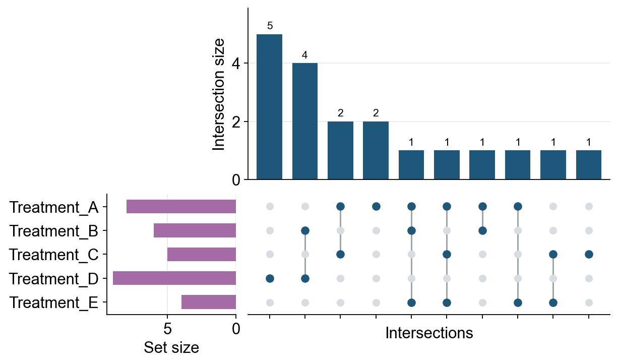
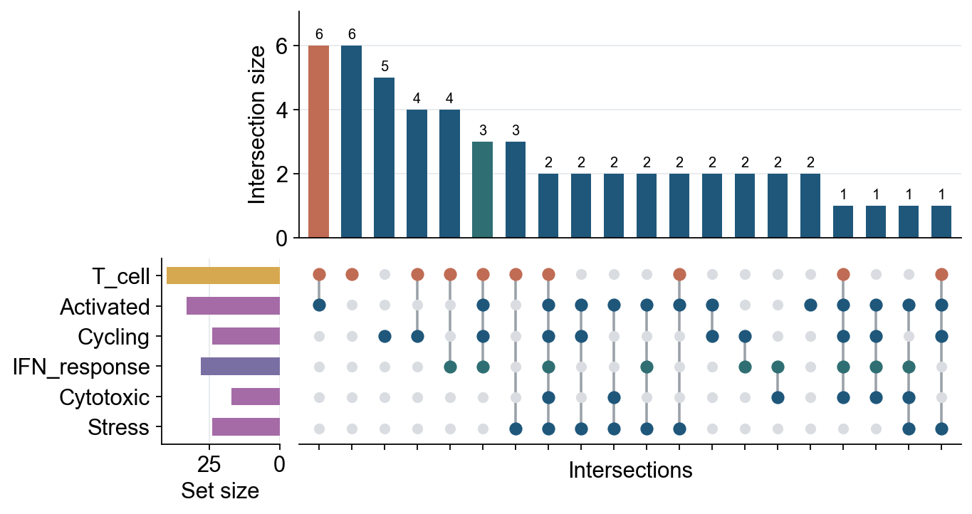
维恩图适合展示 2 到 4 个集合;当基因集或细胞状态集合更多时,UpSet 图通常更易读。它用上方柱状图表示每个精确交集的大小,并用下方点阵表示该交集由哪些集合组成。ov.pl.upset 支持直接输入 Python 集合字典,也支持输入带有布尔列的 AnnData 对象,例如 adata.obs 或 adata.var 中的集合成员标记。
Function: ov.pl.upset:
sets: 集合字典,或AnnData对象。keys: 对于AnnData,指定作为集合的布尔列;对于字典输入,可用于选择或重排集合。axis: 使用AnnData时,"obs"表示细胞集合,"var"表示基因/特征集合。top_n: 最多展示的交集数量。min_size: 保留的最小精确交集大小。style: 可传入ov.style、True或ov.style的参数字典,在绘图前应用 OmicVerse 风格。intersection_color、set_size_color、matrix_color: 可用字符串统一设色,也可用字典只指定部分交集列或集合行的颜色。height_ratios: 设置上方柱状图和下方点阵区域的相对高度,例如(0.55, 0.45)。
# Multiple gene sets can be displayed directly as an UpSet plot.
gene_sets = {
    "Treatment_A": {"IL7R", "CCR7", "LTB", "SELL", "TCF7", "MAL", "CD3D", "CD3E"},
    "Treatment_B": {"CCR7", "LTB", "NKG7", "GZMB", "PRF1", "IFNG"},
    "Treatment_C": {"IL7R", "TCF7", "MAL", "LEF1", "GZMK"},
    "Treatment_D": {"NKG7", "GZMB", "PRF1", "GNLY", "IFNG", "CTSW", "KLRD1", "KLRF1", "CST7"},
    "Treatment_E": {"IL7R", "SELL", "LEF1", "CCR7"},
}

fig, axes = ov.pl.upset(gene_sets, top_n=15, min_size=1, figsize=(8, 5), style=ov.style)
fig.savefig("figures/bulk_upset_gene_sets.png", dpi=300, bbox_inches="tight")
🔬 Starting plot initialization...
🧬 Detecting GPU devices…
✅ Apple Silicon MPS detected
    • [MPS] Apple Silicon GPU - Metal Performance Shaders available
✅ plot_set complete.
# AnnData input uses boolean obs/var columns as set membership indicators.
rng = np.random.default_rng(42)
adata_upset = AnnData(
    np.ones((80, 5)),
    obs=pd.DataFrame(index=[f"cell_{i}" for i in range(80)]),
    var=pd.DataFrame(index=[f"gene_{i}" for i in range(5)]),
)
adata_upset.obs["T_cell"] = rng.random(80) < 0.55
adata_upset.obs["Activated"] = rng.random(80) < 0.42
adata_upset.obs["Cycling"] = rng.random(80) < 0.25
adata_upset.obs["IFN_response"] = rng.random(80) < 0.30
adata_upset.obs["Cytotoxic"] = rng.random(80) < 0.28
adata_upset.obs["Stress"] = rng.random(80) < 0.22
keys = ["T_cell", "Activated", "Cycling", "IFN_response", "Cytotoxic", "Stress"]

fig, axes = ov.pl.upset(
    adata_upset,
    keys=keys,
    axis="obs",
    top_n=20,
    figsize=(9, 5),
    intersection_color={
        "T_cell&Activated": "#C06C54",
        "T_cell&Activated&Cycling&IFN_response": "#2F6F73",
    },
    set_size_color={"T_cell": "#D6A84F", "IFN_response": "#7A6FA3"},
    matrix_color={"T_cell": "#C06C54", "IFN_response": "#2F6F73"},
    bar_width=0.62,
    dot_size=52,
    line_width=1.6,
    count_fontsize=9,
    height_ratios=(0.55, 0.45),
)
fig.savefig("figures/bulk_upset_adata_obs.png", dpi=300, bbox_inches="tight")
火山图#
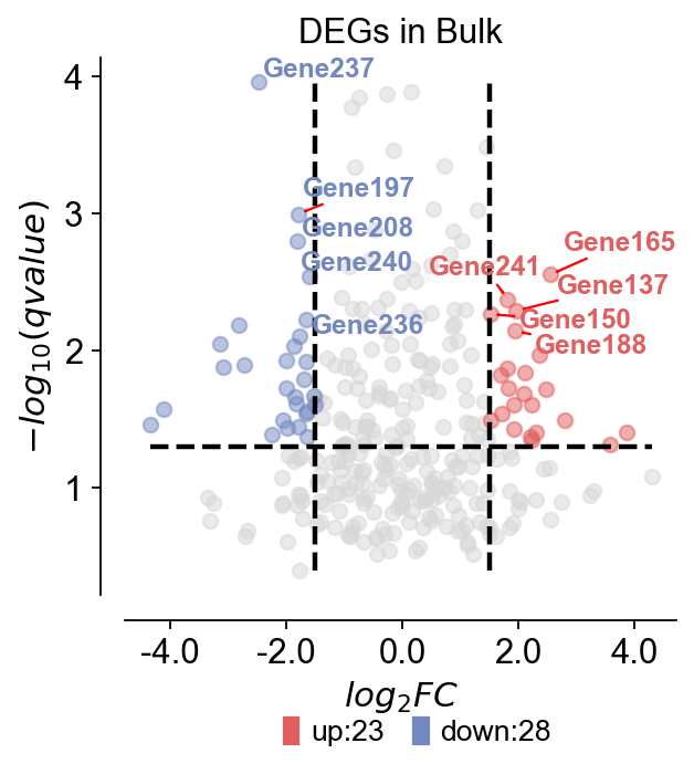
对于差异表达基因,我们通常使用火山图同时展示倍数变化和显著性。这里演示如何使用 Python 中的 ov.pl.volcano 绘制火山图。
Function: ov.pl.volcano:
主要参数:
result: 差异表达分析结果表。pval_name: 用于纵坐标的显著性列名,bulk RNA-seq 中通常为 qvalue。fc_name: 用于横坐标的 fold change 列名,bulk RNA-seq 中通常为 log2FC。fc_max/fc_min: 上调和下调基因的 fold change 阈值。pval_threshold: qvalue 或 pvalue 阈值。pval_max/FC_max: 坐标显示边界,避免极端值影响整体可视化。
绘图参数:
figsize: 图形大小,默认为(4, 4)。title: 图标题,默认为空。titlefont: 标题字体属性字典。up_color、down_color、normal_color: 上调、下调和非显著基因的颜色。legend_bbox、legend_ncol、legend_fontsize: 图例位置、列数和字体大小。plot_genes: 需要标注的基因列表。plot_genes_num: 自动标注的基因数量。plot_genes_fontsize: 标注基因的字体大小。ticks_fontsize: 坐标轴刻度字体大小。
rng = np.random.default_rng(0)
genes = [f"Gene{i}" for i in range(1, 301)]
result = pd.DataFrame({
    "log2FoldChange": rng.normal(0, 1.4, len(genes)),
    "qvalue": np.clip(rng.beta(0.7, 7, len(genes)), 1e-6, 1),
}, index=genes)
result["sig"] = "normal"
result.loc[(result["qvalue"] < 0.05) & (result["log2FoldChange"] > 1.5), "sig"] = "up"
result.loc[(result["qvalue"] < 0.05) & (result["log2FoldChange"] < -1.5), "sig"] = "down"
result.head()
       log2FoldChange    qvalue     sig
Gene1        0.176022  0.146827  normal
Gene2       -0.184947  0.040901  normal
Gene3        0.896592  0.005051  normal
Gene4        0.146860  0.061055  normal
Gene5       -0.749937  0.015369  normal
ov.pl.volcano(result,pval_name='qvalue',fc_name='log2FoldChange',
                     pval_threshold=0.05,fc_max=1.5,fc_min=-1.5,
                      pval_max=10,FC_max=10,
                    figsize=(4,4),title='DEGs in Bulk',titlefont={'weight':'normal','size':14,},
                     up_color='#e25d5d',down_color='#7388c1',normal_color='#d7d7d7',
                     up_fontcolor='#e25d5d',down_fontcolor='#7388c1',normal_fontcolor='#d7d7d7',
                     legend_bbox=(0.8, -0.2),legend_ncol=2,legend_fontsize=12,
                     plot_genes=None,plot_genes_num=10,plot_genes_fontsize=11,
                     ticks_fontsize=12,)
🌋 Volcano Plot Analysis:
   Total genes: 300
   ↗️  Upregulated genes: 23
   ↘️  Downregulated genes: 28
   ➡️  Non-significant genes: 249
   🎯 Total significant genes: 51
   log2FoldChange range: -4.35 to 4.29
   qvalue range: 1.10e-04 to 4.00e-01

⚙️  Current Function Parameters:
   Data columns: pval_name='qvalue', fc_name='log2FoldChange'
   Thresholds: pval_threshold=0.05, fc_max=1.5, fc_min=-1.5
   Plot size: figsize=(4, 4)
   Gene labels: plot_genes_num=10, plot_genes_fontsize=11
   Custom genes: None (auto-select top genes)

💡 Parameter Optimization Suggestions:
   ✅ Current parameters are optimal for your data!
────────────────────────────────────────────────────────────
<Axes: title={'center': 'DEGs in Bulk'}, xlabel='$log_{2}FC$', ylabel='$-log_{10}(qvalue)$'>
箱线图#
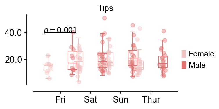
对于不同分组中的表达量或表型数值,我们经常需要比较组间差异,此时可以使用箱线图进行展示。
Function: ov.pl.boxplot:
data: 用于绘制箱线图的数据;本示例使用seaborn.load_dataset("tips")。x_value、y_value、hue: 长格式数据中的分组、数值和分层变量。figsize: 图形大小,默认为(4, 4)。fontsize: 坐标轴刻度和标签字体大小。title: 图标题,默认为空。
Function: ov.pl.add_palue:
ax: 需要添加显著性标注的坐标轴。line_x1、line_x2: 显著性连线的左右位置。line_y: 显著性连线高度。text_y: 显著性文本相对连线的偏移。text: 显著性文本,例如可设置为***或具体 p 值。fontsize: 文本字体大小。fontcolor: 文本颜色。horizontalalignment: 文本水平对齐方式。
import seaborn as sns
data = sns.load_dataset("tips")
data.head()
   total_bill   tip     sex smoker  day    time  size
0       16.99  1.01  Female     No  Sun  Dinner     2
1       10.34  1.66    Male     No  Sun  Dinner     3
2       21.01  3.50    Male     No  Sun  Dinner     3
3       23.68  3.31    Male     No  Sun  Dinner     2
4       24.59  3.61  Female     No  Sun  Dinner     4
fig,ax=ov.pl.boxplot(data,hue='sex',x_value='day',y_value='total_bill',
              palette=ov.pl.red_color,
              figsize=(4,2),fontsize=12,title='Tips',)

ov.pl.add_palue(ax,line_x1=-0.5,line_x2=0.5,line_y=40,
          text_y=0.2,
          text='$p={}$'.format(round(0.001,3)),
          fontsize=11,fontcolor='#000000',
          horizontalalignment='center',)
📊 Boxplot Data Analysis:
   Total samples: 244
   X-axis variable ('day'): ['Fri', 'Sat', 'Sun', 'Thur']
   Hue variable ('sex'): ['Female', 'Male']
   Y-axis variable: 'total_bill' (range: 3.07 - 50.81)

⚙️  Current Function Parameters:
   hue='sex', x_value='day', y_value='total_bill'
   width=0.3, figsize=(4, 2), fontsize=12
   hue_order=None (using alphabetical order)
   📋 Using alphabetical hue order: ['Female', 'Male']

🎯 Box Positioning:
   Number of hue groups: 2
   Box positions: [-0.4, 0.4]
   Box width: 0.3

📈 Sample sizes per group:
   Female × Fri: 9 samples
   Female × Sat: 28 samples
   Female × Sun: 18 samples
   Female × Thur: 32 samples
   Male × Fri: 10 samples
   Male × Sat: 59 samples
   Male × Sun: 58 samples
   Male × Thur: 30 samples

💡 Parameter Optimization Suggestions:
   ✅ Current parameters are optimal for your data!
────────────────────────────────────────────────────────────