Funky heatmaps for benchmark / multi-metric tables#
ov.pl.funky_heatmap wraps the
pyfunkyheatmap package — a
pure-Python port of the R
funkyheatmap package. It
produces dynbenchmark-style figures from a pandas.DataFrame, with no R /
rpy2 dependency.
This tutorial is organised in four parts:
Quick start — six worked examples on
mtcarsand small synthetic benchmarks covering every glyph type.Full mtcars walkthrough — 1:1 port of the R Getting started vignette, building the figure up step by step.
Recreating the scIB figures — 1:1 port of the R scIB vignette, the benchmark figure from Luecken et al. (2022).
dynbenchmark — pointer to the larger figure (51 methods × 159 metrics) and how to reproduce it.
Make sure
pyfunkyheatmapis installed:pip install pyfunkyheatmap.
import omicverse as ov
ov.style(font_path='Arial')

import json
import urllib.request
from io import StringIO
import matplotlib.pyplot as plt
import numpy as np
import pandas as pd

# fixture URLs — same files used by the upstream pyfunkyheatmap repo
_RAW = 'https://raw.githubusercontent.com/omicverse/py-funkyheatmap/main/data/vignettes'
🔬 Starting plot initialization...
Using already downloaded Arial font from: /tmp/omicverse_arial.ttf
Registered as: Arial
🧬 Detecting GPU devices…
✅ NVIDIA CUDA GPUs detected: 1
    • [CUDA 0] NVIDIA H100 80GB HBM3
      Memory: 79.1 GB | Compute: 9.0

   ____            _     _    __
  / __ \____ ___  (_)___| |  / /__  _____________
 / / / / __ `__ \/ / ___/ | / / _ \/ ___/ ___/ _ \
/ /_/ / / / / / / / /__ | |/ /  __/ /  (__  )  __/
\____/_/ /_/ /_/_/\___/ |___/\___/_/  /____/\___/

🔖 Version: 2.2.1rc1   📚 Tutorials: https://omicverse.readthedocs.io/
✅ plot_set complete.
Part 1 · Quick start#
1.1 Default heatmap from a DataFrame#
The simplest call: pass any DataFrame with an id column. Numerical
columns become rounded “funky rectangle” glyphs; text columns become
labels.
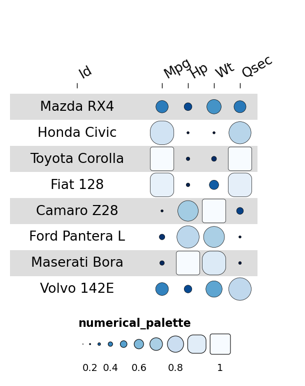
mtcars_small = pd.DataFrame({
    'id':   ['Mazda RX4','Honda Civic','Toyota Corolla','Fiat 128',
             'Camaro Z28','Ford Pantera L','Maserati Bora','Volvo 142E'],
    'mpg':  [21.0, 30.4, 33.9, 32.4, 13.3, 15.8, 15.0, 21.4],
    'hp':   [110, 52, 65, 66, 245, 264, 335, 109],
    'wt':   [2.620, 1.615, 1.835, 2.200, 3.840, 3.170, 3.570, 2.780],
    'qsec': [16.46, 18.52, 19.90, 19.47, 15.41, 14.50, 14.60, 18.60],
})
fh = ov.pl.funky_heatmap(mtcars_small)
fh
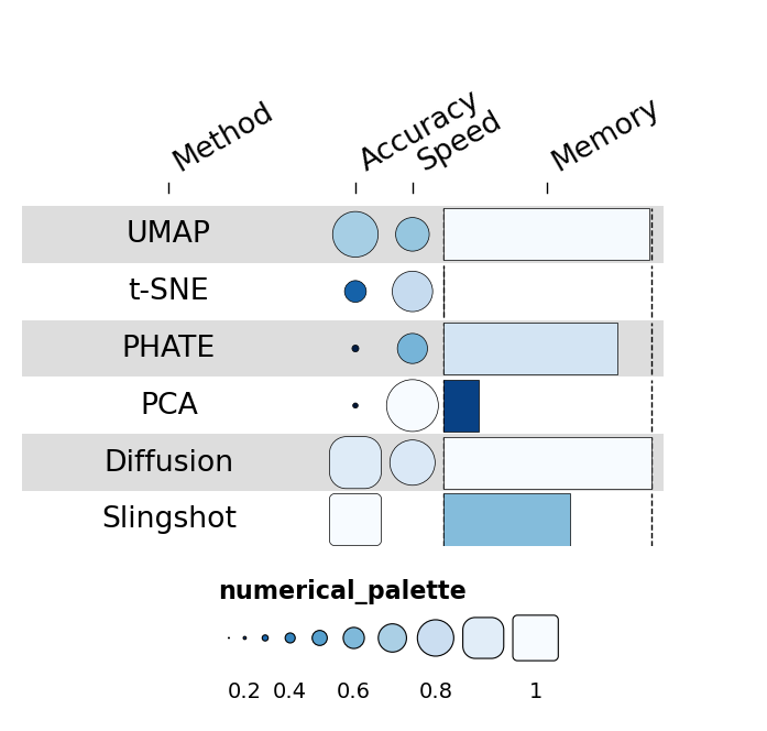
1.2 Mixing geoms via column_info#
column_info chooses a different geom per column. The valid set is
funkyrect, circle, rect, bar, pie, text and
image.
rng = np.random.default_rng(0)
n = 6
benchmark = pd.DataFrame({
    'id':       [f'method_{i}' for i in range(n)],
    'name':     ['UMAP','t-SNE','PHATE','PCA','Diffusion','Slingshot'],
    'accuracy': rng.uniform(0.55, 0.97, n),
    'speed':    rng.uniform(0.10, 0.95, n),
    'memory':   rng.uniform(0.20, 0.95, n),
})
column_info = pd.DataFrame({
    'id':   ['name','accuracy','speed','memory'],
    'name': ['Method','Accuracy','Speed','Memory'],
    'geom': ['text','funkyrect','circle','bar'],
})
fh = ov.pl.funky_heatmap(benchmark, column_info=column_info)
fh
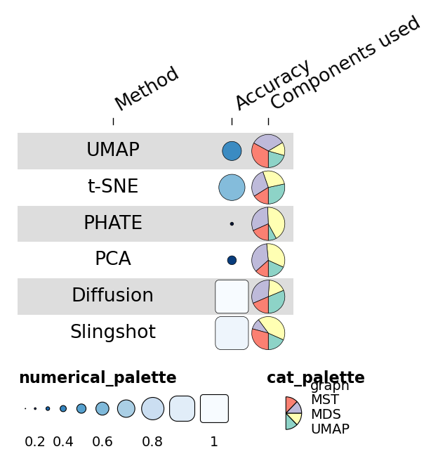
1.3 Pie geoms for compositional data#
If a column contains dicts of categorical proportions, that column renders as a pie — the geom the dynbenchmark heatmap uses for “method components” (e.g. uses graphs / uses MST / uses MDS).
def _comp():
    return {k: float(rng.uniform(0, 1)) for k in ['graph','MST','MDS','UMAP']}

n = 6
df = pd.DataFrame({
    'id':         [f'm{i}' for i in range(n)],
    'name':       ['UMAP','t-SNE','PHATE','PCA','Diffusion','Slingshot'],
    'accuracy':   rng.uniform(0.55, 0.97, n),
    'components': [_comp() for _ in range(n)],
})
column_info = pd.DataFrame({
    'id':      ['name','accuracy','components'],
    'name':    ['Method','Accuracy','Components used'],
    'geom':    ['text','funkyrect','pie'],
    'palette': [None,'numerical_palette','cat_palette'],
})
fh = ov.pl.funky_heatmap(df, column_info=column_info)
fh
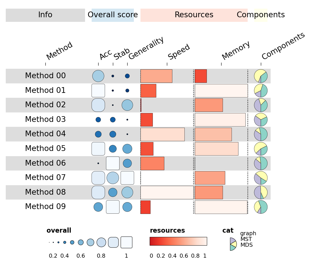
1.4 Column groups + per-group palettes#
For dynbenchmark-style figures, group columns into named categories with
their own palette and a coloured ribbon above the block. The package
draws subfigure letters (a), b), c), …) on the top-level ribbon
automatically.
n = 10
rng = np.random.default_rng(7)
df = pd.DataFrame({
    'id':        [f'm{i}' for i in range(n)],
    'name':      [f'Method {i:02d}' for i in range(n)],
    'overall_a': rng.uniform(0.55, 0.97, n),
    'overall_b': rng.uniform(0.40, 0.95, n),
    'overall_c': rng.uniform(0.50, 0.95, n),
    'speed':     rng.uniform(0.10, 0.95, n),
    'memory':    rng.uniform(0.20, 0.95, n),
    'comp':      [{'graph': rng.uniform(0,1), 'MST': rng.uniform(0,1), 'MDS': rng.uniform(0,1)} for _ in range(n)],
})
column_info = pd.DataFrame({
    'id':      ['name','overall_a','overall_b','overall_c','speed','memory','comp'],
    'name':    ['Method','Acc','Stab','Generality','Speed','Memory','Components'],
    'geom':    ['text','funkyrect','funkyrect','funkyrect','bar','bar','pie'],
    'group':   ['info','overall','overall','overall','resources','resources','comp'],
    'palette': [None,'overall','overall','overall','resources','resources','cat'],
})
column_groups = pd.DataFrame({
    'group':   ['info','overall','resources','comp'],
    'level1':  ['Info','Overall score','Resources','Components'],
    'palette': [None,'overall','resources','cat'],
})
fh = ov.pl.funky_heatmap(df, column_info=column_info, column_groups=column_groups)
fh
1.5 Custom legends#
Pass an explicit legends list — each entry is a dict describing one
legend panel. geom='rect' / 'funkyrect' / 'circle' produces
sized-stop legends; 'bar' produces a continuous gradient.
legends = [
    dict(palette='overall',   geom='rect',
         title='Overall score', labels=['0','','0.5','','1']),
    dict(palette='resources', geom='bar',
         title='Resources',     labels=['lo','','mid','','hi']),
    dict(palette='cat',       geom='pie',
         title='Components',    labels=['graph','MST','MDS']),
]
fh = ov.pl.funky_heatmap(df, column_info=column_info,
                          column_groups=column_groups, legends=legends)
fh
1.6 Row groups#
Highlight a subset of rows by passing row_info + row_groups. The
heatmap renders each group as its own banded block with a labelled
separator.
rng = np.random.default_rng(2026)
methods = (
    [f'graph_{i}' for i in range(4)] +
    [f'tree_{i}'  for i in range(4)] +
    [f'linear_{i}' for i in range(4)]
)
df = pd.DataFrame({
    'id':        methods,
    'name':      methods,
    'accuracy':  rng.uniform(0.4, 0.95, len(methods)),
    'stability': rng.uniform(0.3, 0.9,  len(methods)),
    'speed':     rng.uniform(0.1, 0.95, len(methods)),
    'memory':    rng.uniform(0.2, 0.95, len(methods)),
})
column_info = pd.DataFrame({
    'id':      ['name','accuracy','stability','speed','memory'],
    'name':    ['Method','Accuracy','Stability','Speed','Memory'],
    'geom':    ['text','funkyrect','circle','bar','bar'],
    'group':   ['info','accuracy','stability','resources','resources'],
    'palette': [None,'benchmark','stability','scaling','scaling'],
})
column_groups = pd.DataFrame({
    'group':  ['info','accuracy','stability','resources'],
    'level1': ['Method','Accuracy','Stability','Resources'],
    'palette':[None,'benchmark','stability','scaling'],
})
row_info = pd.DataFrame({
    'id': df['id'],
    'group': ['Graph methods']*4 + ['Tree methods']*4 + ['Linear methods']*4,
})
row_groups = pd.DataFrame({
    'group':  ['Graph methods','Tree methods','Linear methods'],
    'level1': ['Graph methods','Tree methods','Linear methods'],
})
fh = ov.pl.funky_heatmap(
    df, column_info=column_info, column_groups=column_groups,
    row_info=row_info, row_groups=row_groups,
    position_args=ov.pl.funky_position_arguments(col_annot_offset=3.2),
)
fh
Part 2 · Full mtcars walkthrough#
This section is a Python 1:1 port of the R
Getting started
vignette. We start with a bare funky_heatmap(data) call and add
features one at a time.
2.1 Loading the data#
Load mtcars, promote the row names to an id column, sort by mpg
descending and keep the top 30 rows.
csv = urllib.request.urlopen(f'{_RAW}/mtcars.csv').read().decode()
mtcars = pd.read_csv(StringIO(csv)).rename(columns={'Unnamed: 0':'id'})
data = mtcars.sort_values('mpg', ascending=False).head(30).reset_index(drop=True)
data.head()
| id | mpg | cyl | disp | hp | drat | wt | qsec | vs | am | gear | carb | |
|---|---|---|---|---|---|---|---|---|---|---|---|---|
| 0 | Toyota Corolla | 33.9 | 4 | 71.1 | 65 | 4.22 | 1.835 | 19.90 | 1 | 1 | 4 | 1 |
| 1 | Fiat 128 | 32.4 | 4 | 78.7 | 66 | 4.08 | 2.200 | 19.47 | 1 | 1 | 4 | 1 |
| 2 | Lotus Europa | 30.4 | 4 | 95.1 | 113 | 3.77 | 1.513 | 16.90 | 1 | 1 | 5 | 2 |
| 3 | Honda Civic | 30.4 | 4 | 75.7 | 52 | 4.93 | 1.615 | 18.52 | 1 | 1 | 4 | 2 |
| 4 | Fiat X1-9 | 27.3 | 4 | 79.0 | 66 | 4.08 | 1.935 | 18.90 | 1 | 1 | 4 | 1 |
Plot this DataFrame without any additional metadata — it doesn’t look great yet:
ov.pl.funky_heatmap(data)
2.2 Adding column_info#
column_info is a DataFrame with one row per heatmap column. The
required column is id; everything else is optional.
If you want to group columns together, specify the group field.
cinfo = pd.DataFrame({
    'id': data.columns,
    'group': [None, 'Overall', 'Engine', 'Engine', 'Engine', 'Transmission',
              'Overall', 'Performance', 'Engine', 'Transmission',
              'Transmission', 'Engine'],
    'options': ['{}'] * 12,
})
cinfo
| id | group | options | |
|---|---|---|---|
| 0 | id | None | {} |
| 1 | mpg | Overall | {} |
| 2 | cyl | Engine | {} |
| 3 | disp | Engine | {} |
| 4 | hp | Engine | {} |
| 5 | drat | Transmission | {} |
| 6 | wt | Overall | {} |
| 7 | qsec | Performance | {} |
| 8 | vs | Engine | {} |
| 9 | am | Transmission | {} |
| 10 | gear | Transmission | {} |
| 11 | carb | Engine | {} |
ov.pl.funky_heatmap(data, column_info=cinfo)
This doesn’t quite work yet: we need to rearrange the columns so those in the same group are adjacent.
data = data[['id','qsec','mpg','wt','cyl','carb','disp','hp','vs','drat','am','gear']]

cinfo = pd.DataFrame({
    'id': data.columns,
    'group': [None, 'Performance', 'Overall', 'Overall',
              'Engine', 'Engine', 'Engine', 'Engine', 'Engine',
              'Transmission', 'Transmission', 'Transmission'],
    'options': ['{}'] * 12,
})
ov.pl.funky_heatmap(data, column_info=cinfo)
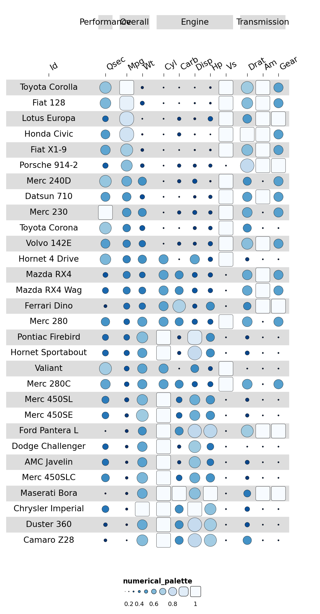
A name column gives each column a human-readable header:
cinfo['name'] = ['Model','1/4 mile time','Miles per gallon','Weight',
                 'Number of cylinders','Carburetors','Displacement','Horsepower',
                 'Engine type','Rear axle ratio','Transmission','Forward gears']
ov.pl.funky_heatmap(data, column_info=cinfo)
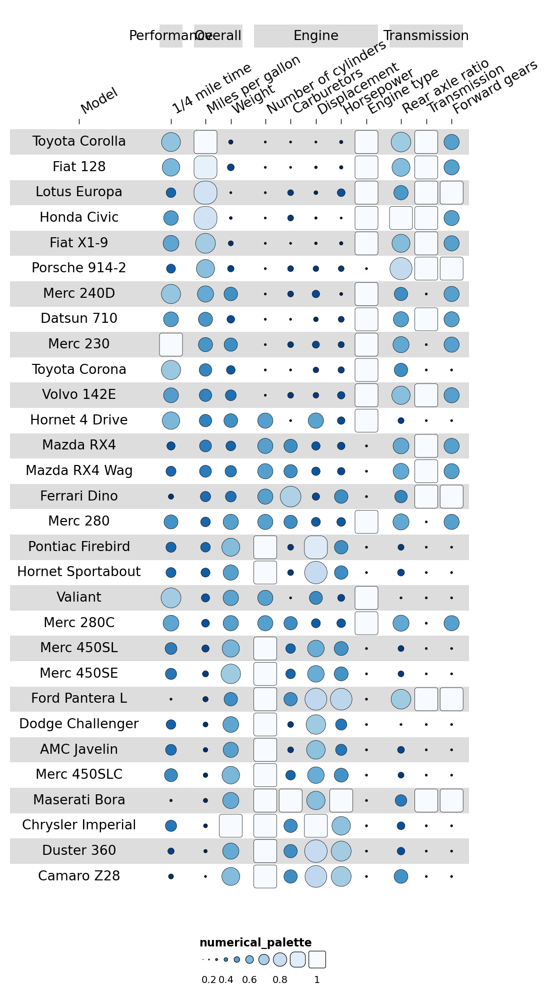
2.3 Adding palettes#
A palette column points each data column to a named palette in the
palettes dict. Built-in palette names:
Numerical:
Blues,Reds,Greens,YlOrBr,GreysCategorical:
Set1,Set2,Set3,Dark2
cinfo['palette'] = [None, 'perf_palette',
'overall_palette', 'overall_palette',
'engine_palette', 'engine_palette', 'engine_palette',
'engine_palette', 'engine_palette',
'transmission_palette', 'transmission_palette', 'transmission_palette']
palettes = {
'perf_palette': 'Blues',
'overall_palette': 'Greens',
'engine_palette': 'YlOrBr',
'transmission_palette': 'Reds',
}
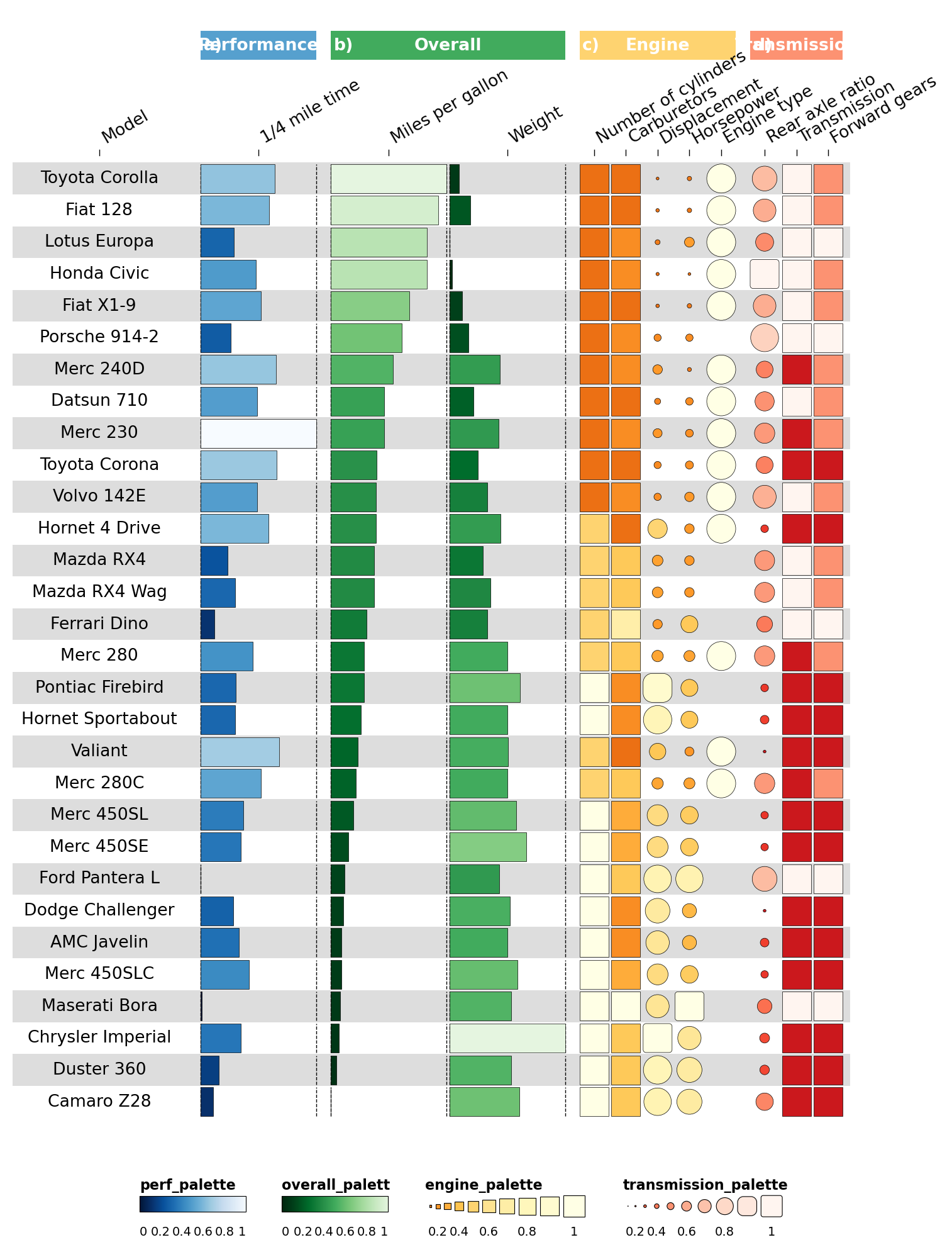
ov.pl.funky_heatmap(data, column_info=cinfo, palettes=palettes)
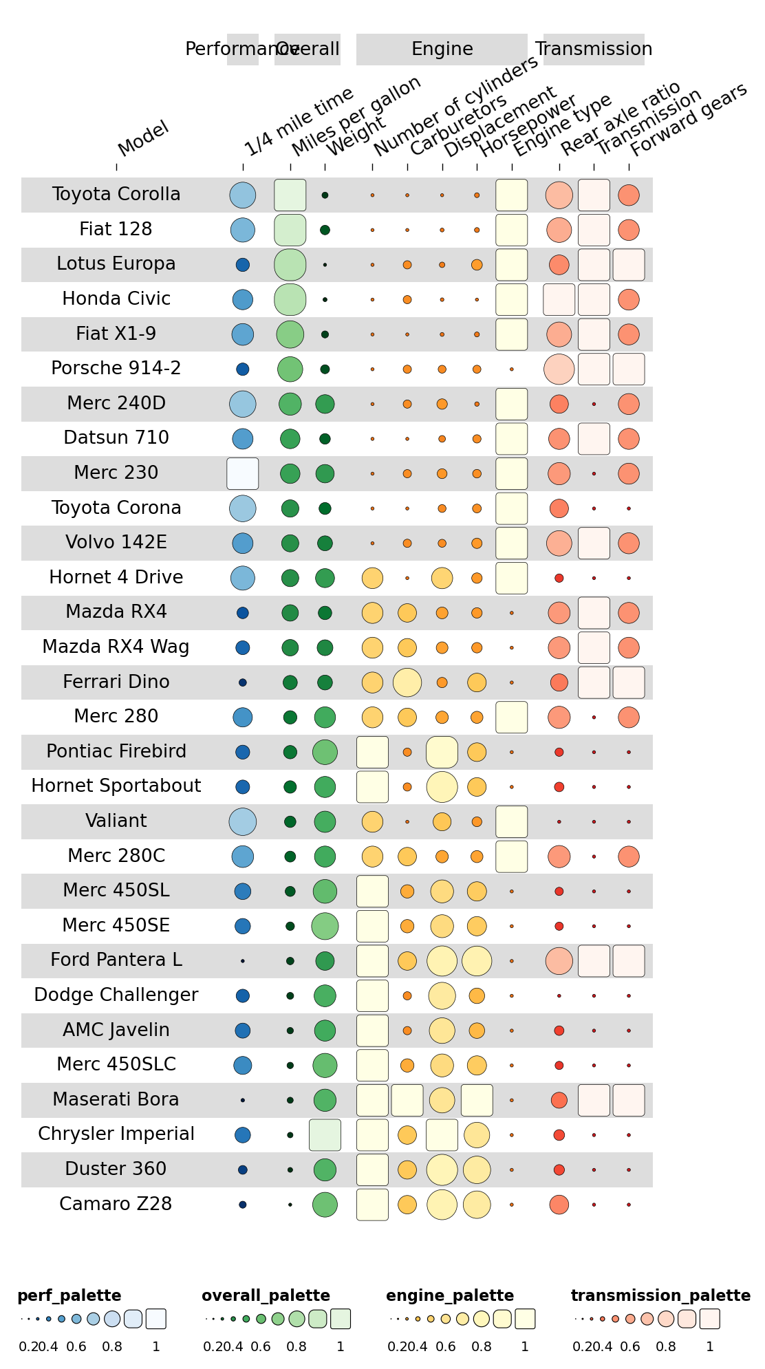
2.4 Adding column_groups#
Colour the column-group ribbons by adding column_groups:
Category(orlevel1) — the display namegroup— links tocolumn_info.grouppalette— colour to use for that ribbon
column_groups = pd.DataFrame({
    'Category': ['Performance','Overall','Engine','Transmission'],
    'group':    ['Performance','Overall','Engine','Transmission'],
    'palette':  ['perf_palette','overall_palette','engine_palette','transmission_palette'],
})
ov.pl.funky_heatmap(data, column_info=cinfo, column_groups=column_groups, palettes=palettes)
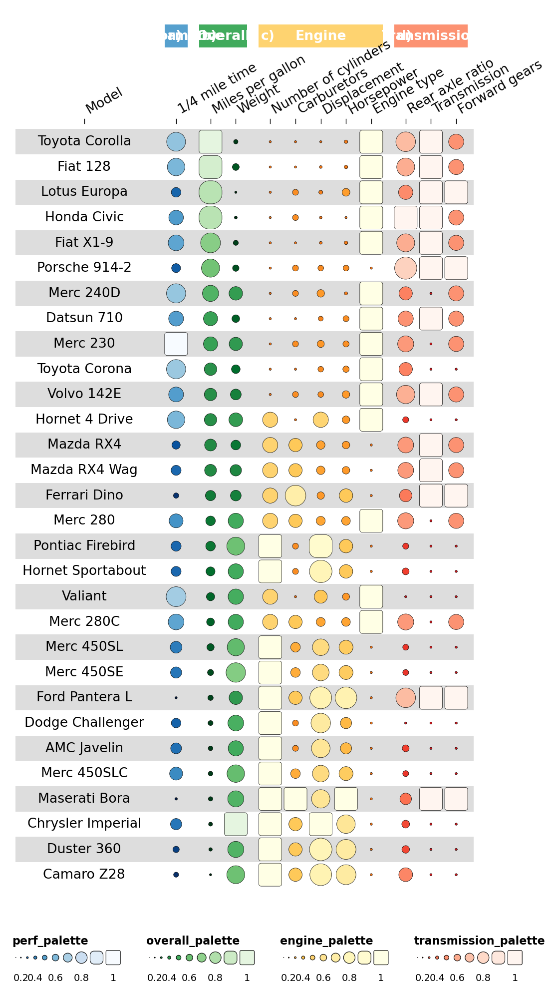
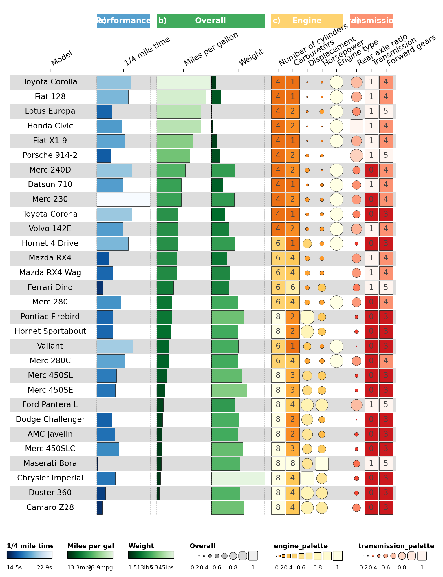
2.5 Specifying geoms#
Make some columns display differently. Cylinder & carb counts are
discrete, so render them as rects; horsepower/displacement keep the
funky rectangle.
cinfo['geom'] = ['text','bar','bar','bar','rect','rect','funkyrect','funkyrect',
                 'circle','funkyrect','rect','rect']
ov.pl.funky_heatmap(data, column_info=cinfo, column_groups=column_groups, palettes=palettes)
Overlay text labels on the discrete rectangle cells:
def insert_overlay_at(df, *, before_iloc1, new_id, group, palette='black'):
    """Mirror R's `add_row(.before=N)` — insert at 1-indexed position."""
    pos = before_iloc1 - 1
    if pos >= len(df):
        pos = len(df)
    row = {
        'id': new_id, 'group': group, 'name': '', 'geom': 'text',
        'options': json.dumps({'overlay': True}), 'palette': palette,
    }
    return pd.concat([df.iloc[:pos], pd.DataFrame([row]), df.iloc[pos:]],
                     ignore_index=True)

cinfo = insert_overlay_at(cinfo, before_iloc1=6,  new_id='cyl',  group='Engine')
cinfo = insert_overlay_at(cinfo, before_iloc1=8,  new_id='carb', group='Engine')
cinfo = insert_overlay_at(cinfo, before_iloc1=14, new_id='am',   group='Transmission')
cinfo = insert_overlay_at(cinfo, before_iloc1=17, new_id='gear', group='Transmission')
palettes['black'] = ['black', 'black']

ov.pl.funky_heatmap(data, column_info=cinfo, column_groups=column_groups, palettes=palettes)

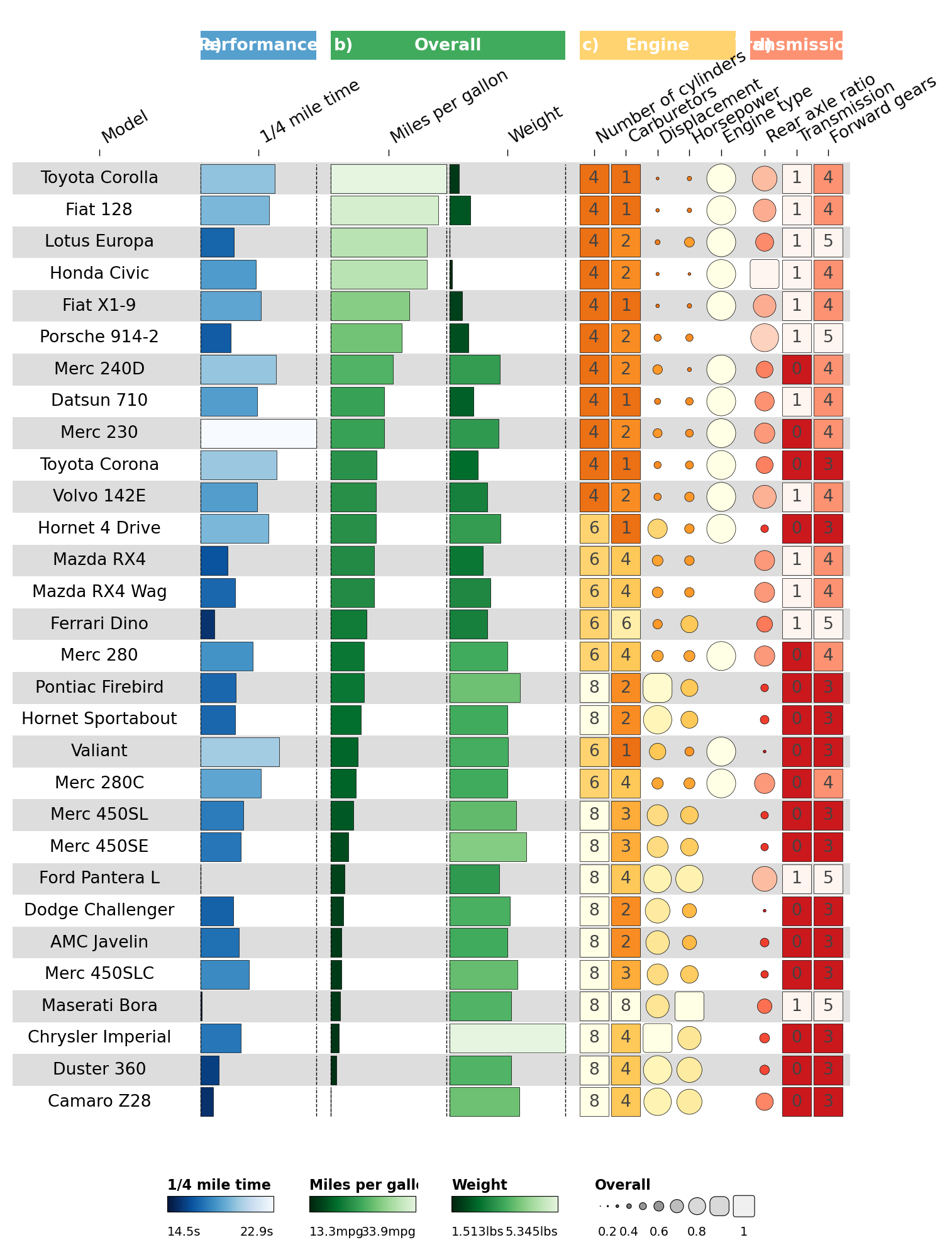
2.6 Customising legends#
Each legends entry describes a legend panel. We can give multiple
legends for the same palette by adding multiple entries.
greys9_rev = list(reversed(['#FFFFFF','#F0F0F0','#D9D9D9','#BDBDBD','#969696',
                            '#737373','#525252','#252525','#000000']))[:-1]
palettes['funky_palette_grey'] = greys9_rev

legends = [
    dict(palette='perf_palette',    geom='bar', title='1/4 mile time',
         labels=[f"{data['qsec'].min()}s"] + [''] * 8 + [f"{data['qsec'].max()}s"]),
    dict(palette='overall_palette', geom='bar', title='Miles per gallon',
         labels=[f"{data['mpg'].min()}mpg"] + [''] * 8 + [f"{data['mpg'].max()}mpg"]),
    dict(palette='overall_palette', geom='bar', title='Weight',
         labels=[f"{data['wt'].min()}lbs"]  + [''] * 8 + [f"{data['wt'].max()}lbs"]),
    dict(palette='funky_palette_grey', geom='funkyrect', title='Overall', enabled=True,
         labels=['0','','0.2','','0.4','','0.6','','0.8','','1']),
]
ov.pl.funky_heatmap(data, column_info=cinfo, column_groups=column_groups,
                    palettes=palettes, legends=legends)
Disable redundant palette legends with enabled=False:
legends = legends + [
    dict(palette='engine_palette',       enabled=False),
    dict(palette='transmission_palette', enabled=False),
]
ov.pl.funky_heatmap(data, column_info=cinfo, column_groups=column_groups,
                    palettes=palettes, legends=legends)
2.7 Row grouping#
Highlight Mercedes cars by adding row_info + row_groups.
row_info = pd.DataFrame({
    'id':    data['id'].to_numpy(),
    'group': ['Mercedes' if 'Merc' in str(x) else 'Other' for x in data['id']],
})
order = row_info['group'].argsort(kind='mergesort')
data = data.iloc[order].reset_index(drop=True)
row_info = row_info.iloc[order].reset_index(drop=True)

row_groups = pd.DataFrame({
    'level1': ['Mercedes', 'Other cars'],
    'group':  ['Mercedes', 'Other'],
})

ov.pl.funky_heatmap(data, column_info=cinfo, column_groups=column_groups,
                    palettes=palettes, legends=legends,
                    row_info=row_info, row_groups=row_groups)
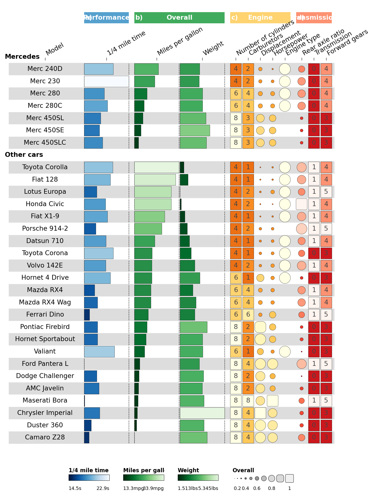
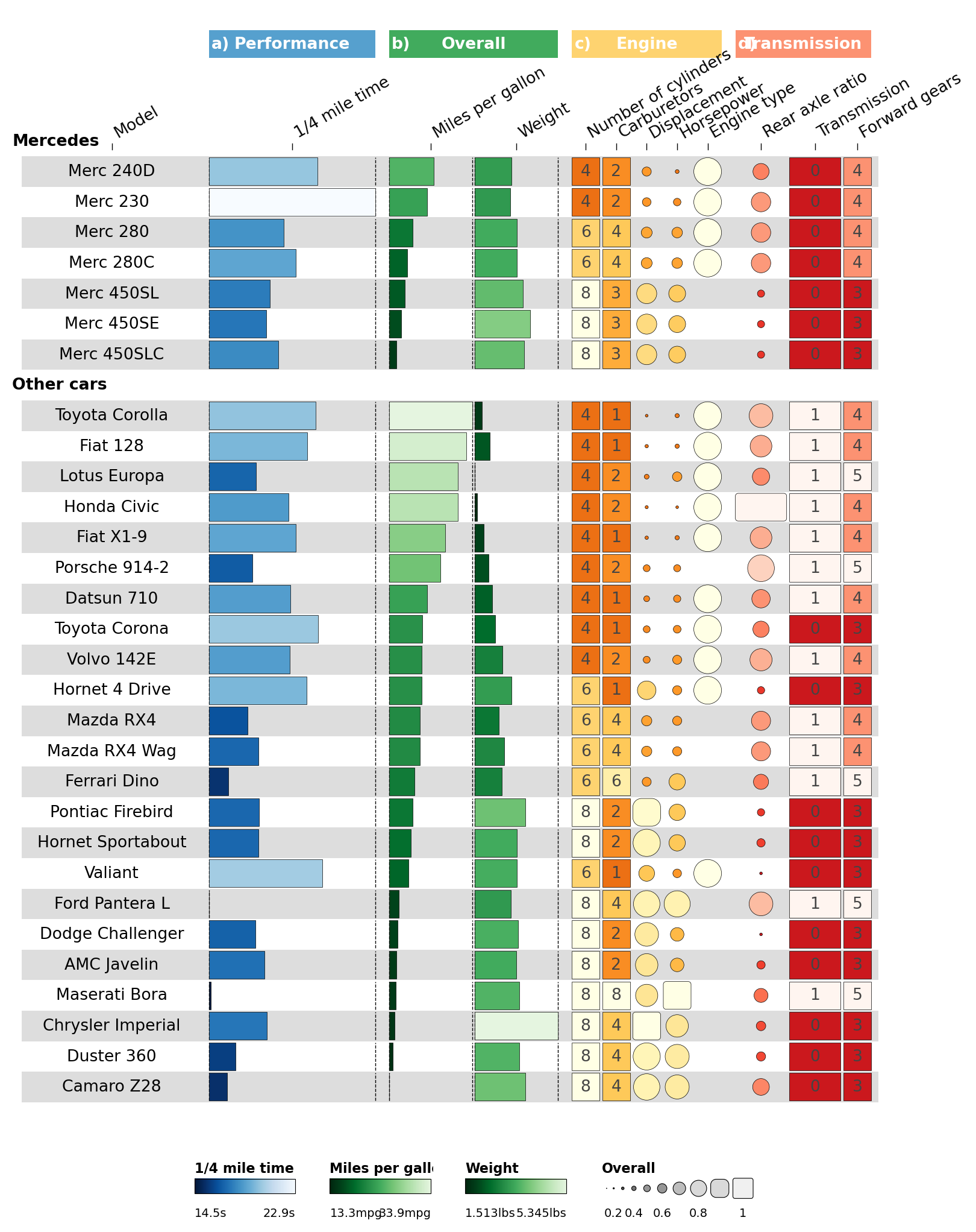
2.8 Final spacing tweaks#
Use the per-column options.width to nudge the Transmission column
group wider.
def set_option(df, iloc, **opts):
    o = json.loads(df.iloc[iloc]['options']) if df.iloc[iloc]['options'] else {}
    o.update(opts)
    df.at[iloc, 'options'] = json.dumps(o)
    return df

for i, w in [(0, 6), (1, 6), (2, 3), (3, 3), (11, 1.85), (12, 1.85)]:
    cinfo = set_option(cinfo, i, width=w)

fh = ov.pl.funky_heatmap(data, column_info=cinfo, column_groups=column_groups,
                         palettes=palettes, legends=legends,
                         row_info=row_info, row_groups=row_groups)
fh
Part 3 · Recreating the scIB figures#
Python 1:1 port of the R scIB vignette.
The scIB project
benchmarked methods for integrating single-cell RNA + ATAC data. We
reproduce the RNA-summary figure using the same fixture table shipped
with funkyheatmap.
3.1 Data#
The figure uses three small icons (matrix / embedding / graph) in its
Output column. We download them from the upstream py-funkyheatmap
repo so the image geom can find them on disk.
from pathlib import Path
Path('images').mkdir(exist_ok=True)
for name in ('matrix', 'embedding', 'graph'):
    dst = Path('images') / f'{name}.png'
    if not dst.exists():
        url = f'https://raw.githubusercontent.com/omicverse/py-funkyheatmap/main/examples/images/{name}.png'
        with urllib.request.urlopen(url) as r, open(dst, 'wb') as f:
            f.write(r.read())
sorted(Path('images').iterdir())
[PosixPath('images/embedding.png'),
 PosixPath('images/graph.png'),
 PosixPath('images/matrix.png')]
csv = urllib.request.urlopen(f'{_RAW}/scib_summary.csv').read().decode()
scib_summary = pd.read_csv(StringIO(csv))
print('shape:', scib_summary.shape)
scib_summary.head().T.head(15)
shape: (20, 27)
| 0 | 1 | 2 | 3 | 4 | |
|---|---|---|---|---|---|
| method | scANVI* | Scanorama | scVI | FastMNN | Harmony |
| output | Embedding | Embedding | Embedding | Embedding | Embedding |
| features | HVG | HVG | HVG | HVG | HVG |
| scaling | Unscaled | Scaled | Unscaled | Unscaled | Unscaled |
| avg_rank | 4.6 | 8.0 | 9.4 | 10.4 | 13.2 |
| overall_immune_cell_hum | 0.821714 | 0.848437 | 0.788039 | 0.845619 | 0.818014 |
| overall_immune_cell_hum_mou | 0.627515 | 0.641593 | 0.636712 | 0.604928 | 0.538062 |
| overall_lung_atlas | 0.755794 | 0.708848 | 0.719602 | 0.708385 | 0.64694 |
| overall_mouse_brain | 0.733199 | 0.672544 | 0.677342 | 0.606238 | 0.690298 |
| overall_pancreas | 0.723885 | 0.703484 | 0.713405 | 0.720063 | 0.790036 |
| overall_simulations_1_1 | 0.852848 | 0.852297 | 0.814174 | 0.744618 | 0.725595 |
| overall_simulations_2 | 0.736584 | 0.526579 | 0.502214 | 0.705207 | 0.687789 |
| rank_immune_cell_hum | 4 | 1 | 14 | 2 | 5 |
| rank_immune_cell_hum_mou | 4.0 | 2.0 | 3.0 | 9.0 | 25.0 |
| rank_lung_atlas | 3.0 | 6.0 | 5.0 | 7.0 | 28.0 |
Prepare the table: add id from row order, relabel scaling/features,
attach output_img paths per output type, compute top-3 rank labels,
and scale rank columns to [0, 1] of negated rank (better → brighter).
def label_top_3(scores, method='average'):
    s = pd.Series(scores)
    ranks = s.rank(method=method, ascending=True)
    return np.where(
        (ranks <= 3) & ranks.notna(),
        ranks.fillna(-1).round().astype(int).astype(str),
        '',
    )

scib = scib_summary.copy()
scib['id'] = (np.arange(len(scib)) + 1).astype(str)
scib['scaling']  = scib['scaling'].map({'Unscaled':'-', 'Scaled':'+'}).astype(str)
scib['features'] = scib['features'].map({'Full':'FULL', 'HVG':'HVG'}).astype(str)
scib['output_img'] = scib['output'].map({
    'Features':  'images/matrix.png',
    'Embedding': 'images/embedding.png',
    'Graph':     'images/graph.png',
})

for col in ['pancreas','lung_atlas','immune_cell_hum','immune_cell_hum_mou',
            'mouse_brain','simulations_1_1','simulations_2']:
    scib[f'label_{col}'] = label_top_3(scib[f'rank_{col}'])
for col, lab in [('package_rank','package_label'), ('paper_rank','paper_label'),
                 ('time_rank','time_label'),       ('memory_rank','memory_label')]:
    scib[lab] = label_top_3(scib[col], method='min')

for col in ['rank_pancreas','rank_lung_atlas','rank_immune_cell_hum',
            'rank_immune_cell_hum_mou','rank_mouse_brain','rank_simulations_1_1',
            'rank_simulations_2','package_rank','paper_rank','time_rank','memory_rank']:
    scib[col] = ov.pl.funky_scale_minmax(-scib[col])

scib.shape
(20, 40)
3.2 Column information#
We replicate the R tribble row-for-row. Each row declares id,
id_color (column used for the colour ramp), name, geom, group,
and an options JSON dict that spreads into per-column knobs (hjust,
width, palette, draw_outline, overlay).
def CI(id_, id_color, name, geom, group, **opts_kw):
    return {'id': id_, 'id_color': id_color, 'name': name,
            'geom': geom, 'group': group, 'options': json.dumps(opts_kw)}

column_info = pd.DataFrame([
    CI('id',                          None,                       'Rank',                'text',  'Method',      hjust=0),
    CI('method',                      None,                       'Method',              'text',  'Method',      hjust=0, width=5),
    CI('output_img',                  None,                       'Output',              'image', 'Method'),
    CI('features',                    'features',                 'Features',            'text',  'Method',      palette='features', width=2),
    CI('scaling',                     None,                       'Scaling',             'text',  'Method',      fontface='bold'),
    CI('overall_pancreas',            'rank_pancreas',            'Pancreas',            'bar',   'RNA',         palette='blues',  width=1.5, draw_outline=False),
    CI('label_pancreas',              None,                       None,                  'text',  'RNA',         hjust=0.1, overlay=True),
    CI('overall_lung_atlas',          'rank_lung_atlas',          'Lung',                'bar',   'RNA',         palette='blues',  width=1.5, draw_outline=False),
    CI('label_lung_atlas',            None,                       None,                  'text',  'RNA',         hjust=0.1, overlay=True),
    CI('overall_immune_cell_hum',     'rank_immune_cell_hum',     'Immune (human)',      'bar',   'RNA',         palette='blues',  width=1.5, draw_outline=False),
    CI('label_immune_cell_hum',       None,                       None,                  'text',  'RNA',         hjust=0.1, overlay=True),
    CI('overall_immune_cell_hum_mou', 'rank_immune_cell_hum_mou', 'Immune (human/mouse)','bar',   'RNA',         palette='blues',  width=1.5, draw_outline=False),
    CI('label_immune_cell_hum_mou',   None,                       None,                  'text',  'RNA',         hjust=0.1, overlay=True),
    CI('overall_mouse_brain',         'rank_mouse_brain',         'Mouse brain',         'bar',   'RNA',         palette='blues',  width=1.5, draw_outline=False),
    CI('label_mouse_brain',           None,                       None,                  'text',  'RNA',         hjust=0.1, overlay=True),
    CI('overall_simulations_1_1',     'rank_simulations_1_1',     'Sim 1',               'bar',   'Simulations', palette='greens', width=1.5, draw_outline=False),
    CI('label_simulations_1_1',       None,                       None,                  'text',  'Simulations', hjust=0.1, overlay=True),
    CI('overall_simulations_2',       'rank_simulations_2',       'Sim 2',               'bar',   'Simulations', palette='greens', width=1.5, draw_outline=False),
    CI('label_simulations_2',         None,                       None,                  'text',  'Simulations', hjust=0.1, overlay=True),
    CI('package_score',               'package_rank',             'Package',             'bar',   'Usability',   palette='oranges', width=1.5, draw_outline=False),
    CI('package_label',               None,                       None,                  'text',  'Usability',   hjust=0.1, overlay=True),
    CI('paper_score',                 'paper_rank',               'Paper',               'bar',   'Usability',   palette='oranges', width=1.5, draw_outline=False),
    CI('paper_label',                 None,                       None,                  'text',  'Usability',   hjust=0.1, overlay=True),
    CI('time_score',                  'time_rank',                'Time',                'bar',   'Scalability', palette='greys',   width=1.5, draw_outline=False),
    CI('time_label',                  None,                       None,                  'text',  'Scalability', hjust=0.1, overlay=True),
    CI('memory_score',                'memory_rank',              'Memory',              'bar',   'Scalability', palette='greys',   width=1.5, draw_outline=False),
    CI('memory_label',                None,                       None,                  'text',  'Scalability', hjust=0.1, overlay=True),
])
column_info.head()
| id | id_color | name | geom | group | options | |
|---|---|---|---|---|---|---|
| 0 | id | None | Rank | text | Method | {"hjust": 0} |
| 1 | method | None | Method | text | Method | {"hjust": 0, "width": 5} |
| 2 | output_img | None | Output | image | Method | {} |
| 3 | features | features | Features | text | Method | {"palette": "features", "width": 2} |
| 4 | scaling | None | Scaling | text | Method | {"fontface": "bold"} |
3.3 Column groups, row info, palettes, legends#
column_groups = pd.DataFrame({
    'group':   ['Method', 'RNA', 'Simulations', 'Usability', 'Scalability'],
    'palette': ['black',  'blues','greens',     'oranges',   'greys'],
    'level1':  ['Method', 'RNA', 'Simulations', 'Usability', 'Scalability'],
})

row_info = pd.DataFrame({'id': scib['id'].astype(str),
                         'group': [None] * len(scib)})

oranges = list(reversed([
    '#FFF5EB','#FEE6CE','#FDD0A2','#FDAE6B','#FD8D3C',
    '#F16913','#D94801','#A63603','#7F2704'
]))
palettes = {
    'features': {'FULL': '#4c4c4c', 'HVG': '#006300'},
    'blues': 'Blues',
    'greens': 'Greens',
    'oranges': oranges,
    'greys': 'Greys',
    'black': ['black','black'],
}

legends = [
    dict(title='Scaling',         geom='text', values=['Scaled','Unscaled'], labels=['+','-'], label_width=.5),
    dict(title='RNA rank',         palette='blues',   geom='rect', labels=['20',' ','10',' ','1'], size=[1,1,1,1,1]),
    dict(title='Simulations rank', palette='greens',  geom='rect', labels=['20',' ','10',' ','1'], size=[1,1,1,1,1]),
    dict(title='Usability rank',   palette='oranges', geom='rect', labels=['20',' ','10',' ','1'], size=[1,1,1,1,1]),
    dict(title='Scalability rank', palette='greys',   geom='rect', labels=['20',' ','10',' ','1'], size=[1,1,1,1,1]),
]
3.4 Render the figure#
fh = ov.pl.funky_heatmap(
    data=scib,
    column_info=column_info,
    column_groups=column_groups,
    row_info=row_info,
    palettes=palettes,
    legends=legends,
    position_args=ov.pl.funky_position_arguments(col_annot_offset=4),
    scale_column=False,
    fig_scale=0.22,
    dpi=120,
)
fh
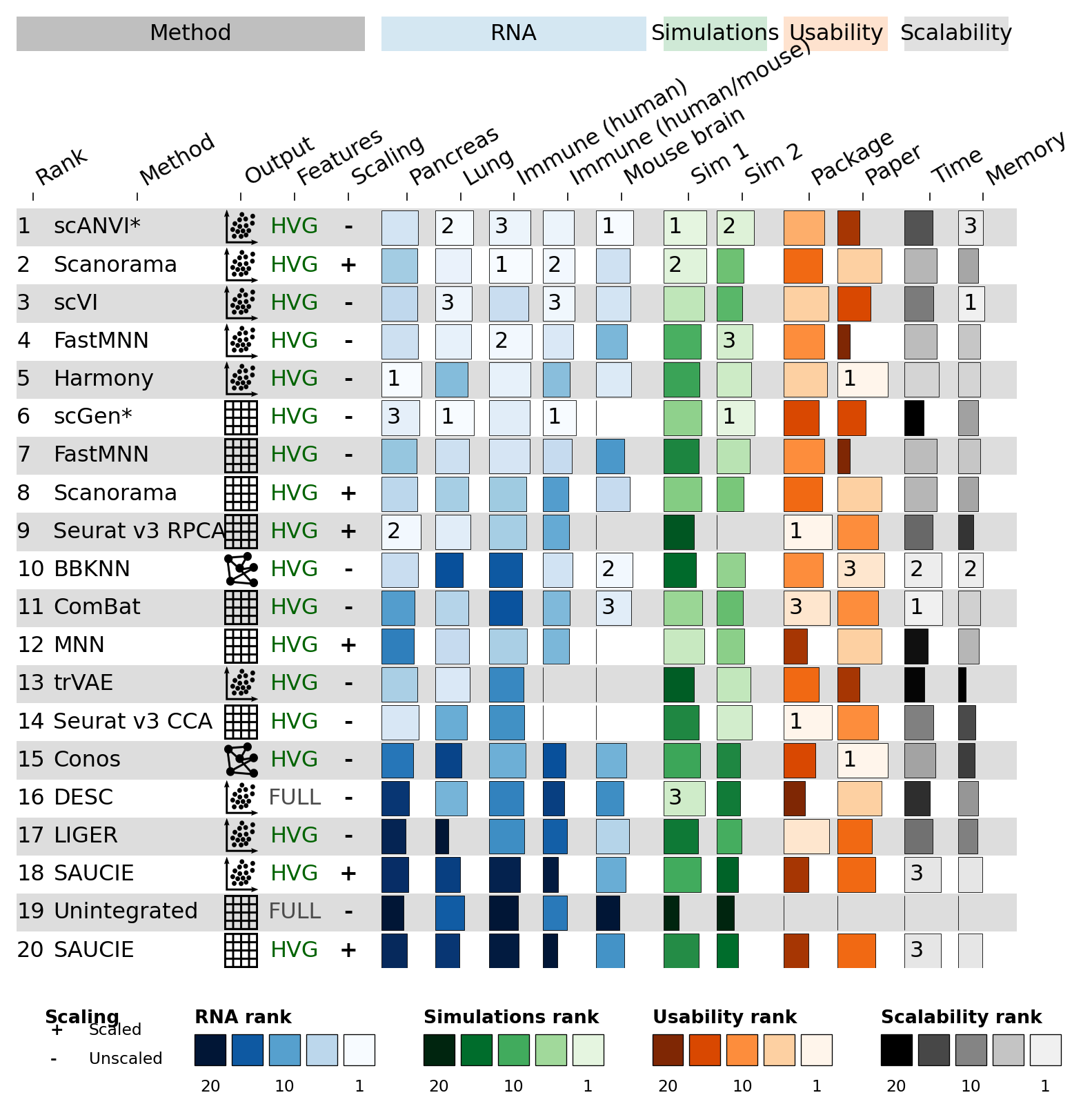
The figure shows the same 20 methods, the same RNA / Simulations / Usability / Scalability column groups, top-3 rank labels overlaid on each bar, and a five-panel legend strip at the bottom (Scaling text legend + four rank gradient legends).
Part 4 · dynbenchmark#
The full dynbenchmark figure — 51 trajectory-inference methods × 159
columns — would be too long to include inline. See the upstream
examples/dynbenchmark.ipynb
for the complete reproduction with row groups (Graph / Tree / Multi /
Bi / Linear / Cyclic methods) and the six-palette legend strip.
A miniature version is included as Quick start §1.6.
References#
Saelens, W., Cannoodt, R., Todorov, H. et al. A comparison of single-cell trajectory inference methods. Nat Biotechnol 37, 547–554 (2019).
Luecken, M.D., Büttner, M., Chaichoompu, K. et al. Benchmarking atlas-level data integration in single-cell genomics. Nat Methods 19, 41–50 (2022).