
Clinical statistics and figure assembly#
omicverse is strong on omics-specific figures — embeddings, spatial maps,
cell-cell communication — but a paper needs more than those. A cohort needs a
survival curve, a classifier needs an ROC, a set of effect sizes needs a forest
plot, and all of it has to end up as one correctly sized panel figure whose
text is still editable in Illustrator.
This tutorial covers the part of ov.pl that does that:
Function |
What it draws |
|---|---|
|
Kaplan-Meier curves, confidence band, numbers at risk, log-rank test, hazard ratio |
|
Aalen-Johansen incidence under competing risks, Gray’s test |
|
ROC curves with DeLong confidence intervals, multi-model and multi-class |
|
Confusion matrix with accuracy / balanced accuracy / kappa / per-class F1 |
|
Effect sizes with CIs, subgroups, fixed/random-effects meta-analysis |
|
A canvas sized in mm / cm / inches / pixels, or by journal column preset |
|
A labelled panel grid or mosaic |
|
The |
|
Export to several formats at once, keeping text as text |
|
Move a legend outside the axes |
Two things are worth saying up front.
None of these needs an AnnData. They take a pandas.DataFrame and column
names, or bare NumPy arrays, or an AnnData (in which case .obs is used).
The last section shows all three forms giving the same answer.
The statistics are real. The estimators are implemented on NumPy/SciPy and
pinned in the test suite against lifelines (Kaplan-Meier, log-rank,
Aalen-Johansen), R pROC (DeLong intervals), R cmprsk (Gray’s test) and
statsmodels (meta-analysis).
import logging
import os
import warnings

warnings.filterwarnings("ignore")
logging.getLogger("fontTools").setLevel(logging.WARNING)

import numpy as np
import pandas as pd
import matplotlib.pyplot as plt
import omicverse as ov

os.makedirs("figures", exist_ok=True)
os.makedirs("data", exist_ok=True)
ov.plot_set()
🔬 Starting plot initialization...
🧬 Detecting GPU devices…
✅ NVIDIA CUDA GPUs detected: 1
    • [CUDA 0] NVIDIA H100 80GB HBM3
      Memory: 79.1 GB | Compute: 9.0

   ____            _     _    __
  / __ \____ ___  (_)___| |  / /__  _____________
 / / / / __ `__ \/ / ___/ | / / _ \/ ___/ ___/ _ \
/ /_/ / / / / / / / /__ | |/ /  __/ /  (__  )  __/
\____/_/ /_/ /_/_/\___/ |___/\___/_/  /____/\___/

🔖 Version: 2.2.1rc1   📚 Tutorials: https://omicverse.readthedocs.io/
✅ plot_set complete.
1. The cohort#
We use the TCGA Pan-Cancer Clinical Data Resource (Liu et al., Cell 2018,
“An Integrated TCGA Pan-Cancer Clinical Data Resource to Drive High-Quality
Survival Outcome Analytics”), served as a plain table by UCSC Xena. It covers
12,591 samples across 33 cancer types and — importantly for the competing-risk
section — records both overall survival (OS) and disease-specific survival
(DSS), so we can tell a cancer death from a death of another cause.
url = ("https://pancanatlas.xenahubs.net/download/"
       "Survival_SupplementalTable_S1_20171025_xena_sp")
path = "data/tcga_pancancer_clinical.tsv"
if not os.path.exists(path):
    pd.read_csv(url, sep="\t").to_csv(path, sep="\t", index=False)
clin = pd.read_csv(path, sep="\t")
clin.shape
(12591, 34)
clin[["cancer type abbreviation", "age_at_initial_pathologic_diagnosis",
      "ajcc_pathologic_tumor_stage", "OS", "OS.time", "DSS"]].head()
| cancer type abbreviation | age_at_initial_pathologic_diagnosis | ajcc_pathologic_tumor_stage | OS | OS.time | DSS | |
|---|---|---|---|---|---|---|
| 0 | ACC | 58.0 | Stage II | 1.0 | 1355.0 | 1.0 |
| 1 | ACC | 44.0 | Stage IV | 1.0 | 1677.0 | 1.0 |
| 2 | ACC | 23.0 | Stage III | 0.0 | 2091.0 | 0.0 |
| 3 | ACC | 23.0 | Stage IV | 1.0 | 423.0 | 1.0 |
| 4 | ACC | 30.0 | Stage III | 1.0 | 365.0 | 1.0 |
A little tidying: overall survival in months, and the AJCC pathologic
stage collapsed into early (I-II) versus advanced (III-IV). Stage strings in
TCGA are messy (Stage IIIA, Stage IIB, [Discrepancy], …), so we map on
the Roman numeral.
def stage_group(value):
    text = str(value)
    if "IV" in text or "III" in text:
        return "Stage III-IV"
    if "II" in text or "I" in text:
        return "Stage I-II"
    return None

clin["months"] = clin["OS.time"] / 30.44
clin["stage"] = clin["ajcc_pathologic_tumor_stage"].map(stage_group)
clin["stage"] = pd.Categorical(clin["stage"], ["Stage I-II", "Stage III-IV"])
cohort = clin.dropna(subset=["months", "OS", "stage"])
cohort = cohort[cohort["months"] > 0]
kirc = cohort[cohort["cancer type abbreviation"] == "KIRC"]
print(f"{len(cohort)} patients across {cohort['cancer type abbreviation'].nunique()} cancer types")
kirc["stage"].value_counts()
8051 patients across 21 cancer types
stage
Stage I-II      550
Stage III-IV    388
Name: count, dtype: int64
2. Kaplan-Meier curves — ov.pl.survival#
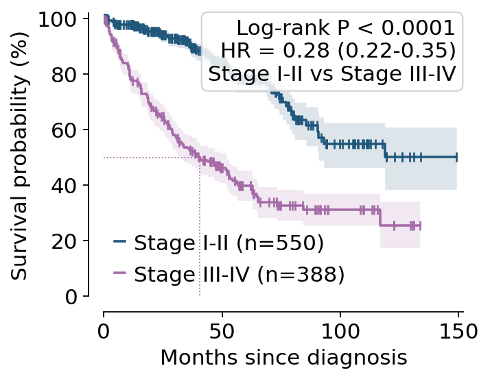
Clear-cell renal carcinoma (KIRC) is a good first example: stage is strongly prognostic and the cohort is large enough for a stable curve.
The default draws everything a reviewer will ask for — the log-log confidence band, censoring ticks, the numbers-at-risk table, the log-rank P value and the hazard ratio. The time axis is handed down to the risk table, which is where journals put it.
ax = ov.pl.survival(kirc, time="months", event="OS", group="stage",
                    figsize=(4.6, 4.4), title="TCGA KIRC — overall survival")
plt.show()

Everything the plot annotates is also returned, so the numbers can go into the text of a paper rather than being read off a figure.
ax, stats = ov.pl.survival(kirc, "months", "OS", "stage",
                           figsize=(4.6, 4.4), return_stats=True)
plt.close()
lo, hi = stats["hazard_ratio_ci"]
print(f"log-rank chi2 = {stats['statistic']:.1f}, P = {stats['pvalue']:.2e}")
print(f"HR = {stats['hazard_ratio']:.2f} ({lo:.2f}-{hi:.2f}), "
      f"{stats['groups'][0]} vs {stats['hazard_ratio_reference']}")
log-rank chi2 = 140.0, P = 2.64e-32
HR = 0.28 (0.22-0.35), Stage I-II vs Stage III-IV
def fmt(value):
    return "not reached" if not np.isfinite(value) else f"{value:.1f}"

for level, fit in stats["fits"].items():
    lo, hi = fit["median_ci"]
    print(f"{level:<14} n={fit['n']:>4}  events={fit['n_events']:>4}  "
          f"median = {fmt(fit['median'])} months (95% CI {fmt(lo)}-{fmt(hi)})")
Stage I-II     n= 550  events= 112  median = not reached months (95% CI 90.8-not reached)
Stage III-IV   n= 388  events= 226  median = 40.4 months (95% CI 32.6-52.2)
The reference group is the first level — taken from the Categorical
category order if the column has one, and otherwise from sorting the labels.
It never depends on which patient happens to be first in the file. Pass
groups= to choose it explicitly and flip the direction of the hazard ratio.
flipped = ov.pl.logrank_test(kirc["months"], kirc["OS"], kirc["stage"],
                             groups=["Stage III-IV", "Stage I-II"])
lo, hi = flipped["hazard_ratio_ci"]
print(f"HR = {flipped['hazard_ratio']:.2f} ({lo:.2f}-{hi:.2f}), "
      f"advanced vs early  —  the same chi2 = {flipped['statistic']:.1f}")
HR = 3.58 (2.87-4.47), advanced vs early — the same chi2 = 140.0
The same call works without any table at all — pass arrays. This is the point of the whole group: nothing here is tied to a container.
ax = ov.pl.survival(time=kirc["months"].to_numpy(),
                    event=kirc["OS"].to_numpy(),
                    group=kirc["stage"].astype(str).to_numpy(),
                    figsize=(4.2, 3.4), risk_table=False, percent=True,
                    median_line=True, xlabel="Months since diagnosis")
plt.show()
3. Competing risks — ov.pl.cumulative_incidence#
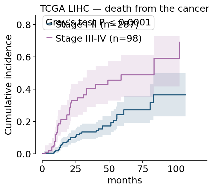
Older TCGA patients die of things other than their tumour. If we ask “what
fraction relapse-free died of cancer by five years?” and answer it with
1 - KM, treating a death from another cause as censoring, the answer is too
high — censoring assumes the patient could still have had the event, and a dead
patient cannot.
DSS marks disease-specific death, so we can build a proper competing-risk
coding: 1 = death from the cancer, 2 = death from another cause, 0 =
alive at last contact.
both = cohort.dropna(subset=["DSS"]).copy()
both["cause"] = np.where(both["OS"] == 0, 0, np.where(both["DSS"] == 1, 1, 2))
lihc = both[both["cancer type abbreviation"] == "LIHC"]
pd.Series(lihc["cause"]).map({0: "censored", 1: "cancer death",
                              2: "other-cause death"}).value_counts()
cause
censored             249
cancer death          80
other-cause death     56
Name: count, dtype: int64
ax = ov.pl.cumulative_incidence(lihc, "months", "cause", "stage", cause=1,
                                figsize=(4.4, 3.8), ci=True,
                                title="TCGA LIHC — death from the cancer")
plt.show()
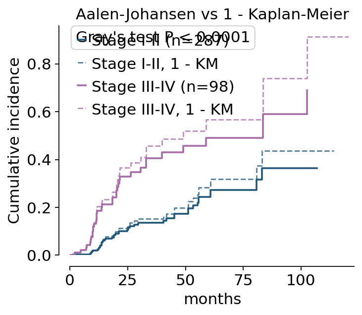
show_naive_km=True overlays the 1 - KM curve that ignores the
competing risk, as a dashed line. It is always at or above the correct curve;
the gap is the size of the mistake.
ax = ov.pl.cumulative_incidence(lihc, "months", "cause", "stage", cause=1,
                                figsize=(4.6, 3.8), show_naive_km=True,
                                title="Aalen-Johansen vs 1 - Kaplan-Meier")
plt.show()
fit = ov.pl.aalen_johansen(lihc["months"], lihc["cause"], cause=1)
km = ov.pl.kaplan_meier(lihc["months"], lihc["cause"] == 1)
at = lambda t, v, q: v[np.searchsorted(t, q, side="right") - 1]
print(f"5-year cancer death, Aalen-Johansen : {at(fit['timeline'], fit['cif'], 60):.3f}")
print(f"5-year cancer death, 1 - KM         : {1 - at(km['timeline'], km['survival'], 60):.3f}")
5-year cancer death, Aalen-Johansen : 0.311
5-year cancer death, 1 - KM         : 0.360
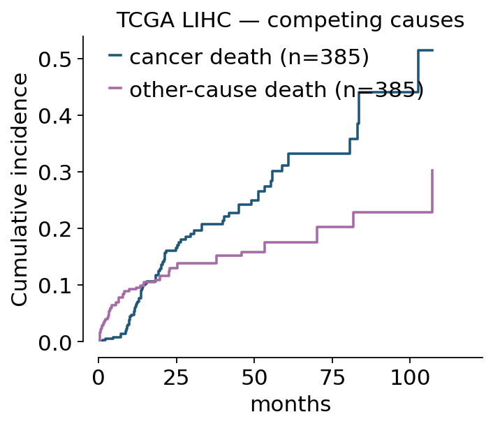
Both causes can be shown together for one cohort, which makes the partition explicit: the two curves plus the survivors add up to 1.
ax = ov.pl.cumulative_incidence(lihc, "months", "cause", cause=[1, 2],
                                cause_labels={1: "cancer death",
                                              2: "other-cause death"},
                                figsize=(4.4, 3.6), test=False,
                                title="TCGA LIHC — competing causes")
plt.show()
4. Forest plots — ov.pl.forest#
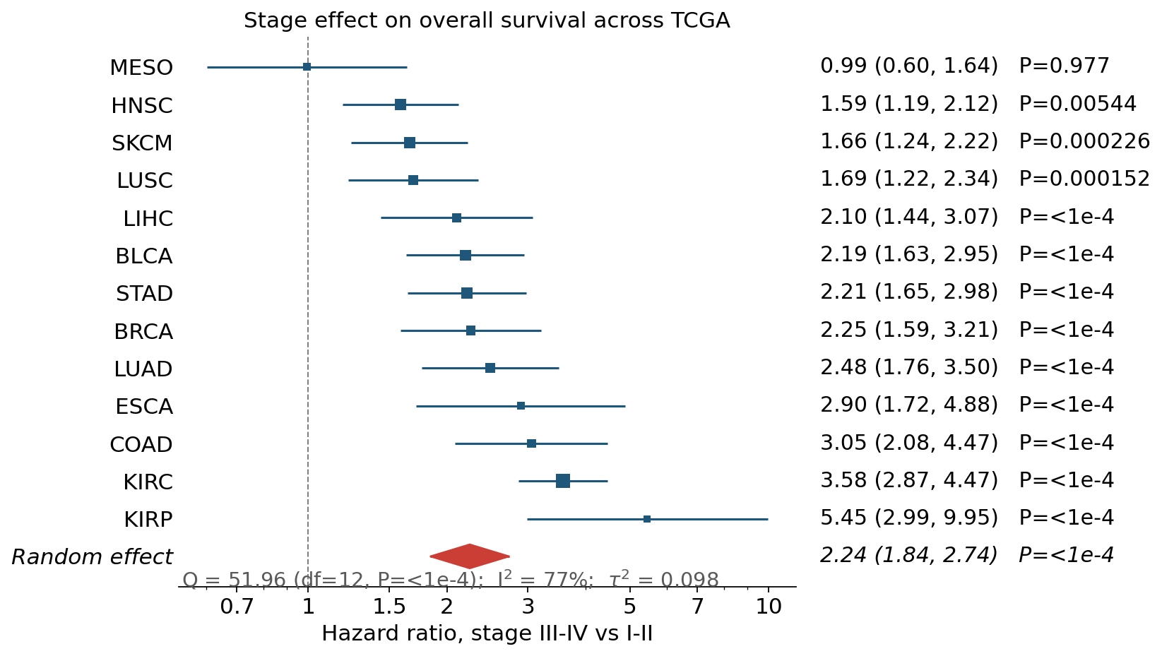
Now the same stage comparison across every cancer type with enough events. For each type we take the log-rank hazard ratio and its standard error, then pool them. This is exactly the shape a forest plot exists for.
stages = ["Stage III-IV", "Stage I-II"]
rows = []
for name, part in cohort.groupby("cancer type abbreviation", observed=True):
    counts = part.groupby("stage", observed=False)["OS"].sum()
    if counts.reindex(stages).min() < 15:
        continue
    res = ov.pl.logrank_test(part["months"], part["OS"], part["stage"],
                             groups=stages)
    rows.append({"cancer": name, "HR": res["hazard_ratio"],
                 "se": np.sqrt(1 / res["expected"][0] + 1 / res["expected"][1]),
                 "P": res["pvalue"], "n": len(part)})
hr = pd.DataFrame(rows).sort_values("HR")
hr.head()
| cancer | HR | se | P | n | |
|---|---|---|---|---|---|
| 10 | MESO | 0.993131 | 0.255424 | 0.977417 | 85 |
| 4 | HNSC | 1.585311 | 0.147830 | 0.005438 | 527 |
| 11 | SKCM | 1.659092 | 0.148302 | 0.000226 | 424 |
| 9 | LUSC | 1.690619 | 0.165445 | 0.000152 | 611 |
| 7 | LIHC | 2.099226 | 0.193818 | 0.000005 | 398 |
log_scale=True puts the ratios on a log axis with the null at 1, which
is the only honest way to draw a ratio: it makes HR = 0.5 and HR = 2 the same
distance from the line. meta='random' adds the DerSimonian-Laird pooled
estimate as a diamond, with Q, I² and tau² underneath.
ax = ov.pl.forest(hr, "HR", se="se", label="cancer", pvalue="P",
                  log_scale=True, meta="random", figsize=(7.0, 6.4),
                  xlabel="Hazard ratio, stage III-IV vs I-II",
                  title="Stage effect on overall survival across TCGA")
plt.show()
ax, meta = ov.pl.forest(hr, "HR", se="se", label="cancer", log_scale=True,
                        meta="both", figsize=(6.4, 6.0), return_stats=True)
plt.close()
pooled = meta["meta"]["random"]
print(f"pooled HR = {np.exp(pooled['estimate']):.2f} "
      f"({np.exp(pooled['lower']):.2f}-{np.exp(pooled['upper']):.2f})")
print(f"heterogeneity: I2 = {100 * pooled['I2']:.0f}%, tau2 = {pooled['tau2']:.3f}, Q P = {pooled['Q_pvalue']:.1e}")
pooled HR = 2.24 (1.84-2.74)
heterogeneity: I2 = 77%, tau2 = 0.098, Q P = 6.3e-07
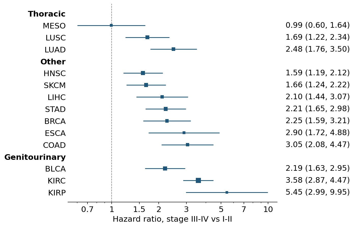
Subgroups get bold headers and keep their block together — useful when the rows fall into families (organ system, platform, study site).
hr["organ"] = np.where(hr["cancer"].isin(["LUAD", "LUSC", "MESO"]), "Thoracic",
                np.where(hr["cancer"].isin(["KIRC", "KIRP", "BLCA", "PRAD"]), "Genitourinary",
                         "Other"))
ax = ov.pl.forest(hr, "HR", se="se", label="cancer", group="organ",
                  log_scale=True, figsize=(6.6, 6.4),
                  xlabel="Hazard ratio, stage III-IV vs I-II")
plt.show()
5. ROC curves — ov.pl.roc#
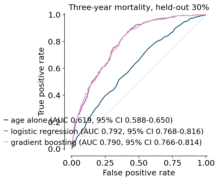
A different question: can we predict three-year mortality from what is known at diagnosis? We keep the patients whose outcome at three years is unambiguous — either they died within three years, or they were followed for at least three years — and fit two models on age, stage, sex and cancer type.
model_df = both.dropna(subset=["age_at_initial_pathologic_diagnosis", "stage", "gender"]).copy()
resolved = (model_df["months"] >= 36) | (model_df["OS"] == 1)
model_df = model_df[resolved]
model_df["died_3y"] = ((model_df["OS"] == 1) & (model_df["months"] < 36)).astype(int)
print(f"{len(model_df)} patients, {model_df['died_3y'].mean():.1%} died within 3 years")
4373 patients, 38.2% died within 3 years
features = pd.get_dummies(
    model_df[["age_at_initial_pathologic_diagnosis", "stage", "gender",
              "cancer type abbreviation"]],
    columns=["stage", "gender", "cancer type abbreviation"], drop_first=True,
).astype(float)
target = model_df["died_3y"].to_numpy()
features.shape
(4373, 23)
from sklearn.ensemble import GradientBoostingClassifier
from sklearn.linear_model import LogisticRegression
from sklearn.model_selection import train_test_split
from sklearn.preprocessing import StandardScaler

X_tr, X_te, y_tr, y_te = train_test_split(features.to_numpy(), target,
                                          test_size=0.3, random_state=0,
                                          stratify=target)
scaler = StandardScaler().fit(X_tr)
logit = LogisticRegression(max_iter=2000).fit(scaler.transform(X_tr), y_tr)
boost = GradientBoostingClassifier(random_state=0).fit(X_tr, y_tr)
age_only = LogisticRegression(max_iter=2000).fit(X_tr[:, :1], y_tr)
The legend carries the AUC and its DeLong 95% interval — the analytic
interval that R’s pROC computes, not a bootstrap approximation.
scores = {"age alone": age_only.predict_proba(X_te[:, :1])[:, 1],
          "logistic regression": logit.predict_proba(scaler.transform(X_te))[:, 1],
          "gradient boosting": boost.predict_proba(X_te)[:, 1]}
ax = ov.pl.roc(y_true=y_te, y_score=scores, figsize=(4.4, 4.4),
               title="Three-year mortality, held-out 30%")
plt.show()
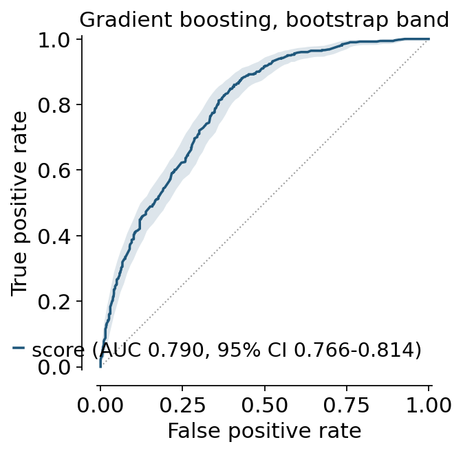
ci='bootstrap' additionally shades the curve itself, which shows where
the model is actually resolved and where a handful of patients are carrying the
shape.
ax, roc_stats = ov.pl.roc(y_te, scores["gradient boosting"],
                          ci="bootstrap", n_boot=400, figsize=(4.0, 4.0),
                          title="Gradient boosting, bootstrap band",
                          return_stats=True)
plt.show()
curve = roc_stats["curves"]["score"]
print(f"AUC = {curve['auc']:.3f} (95% CI {curve['lower']:.3f}-{curve['upper']:.3f}), SE = {curve['se']:.4f}")
AUC = 0.790 (95% CI 0.766-0.814), SE = 0.0123
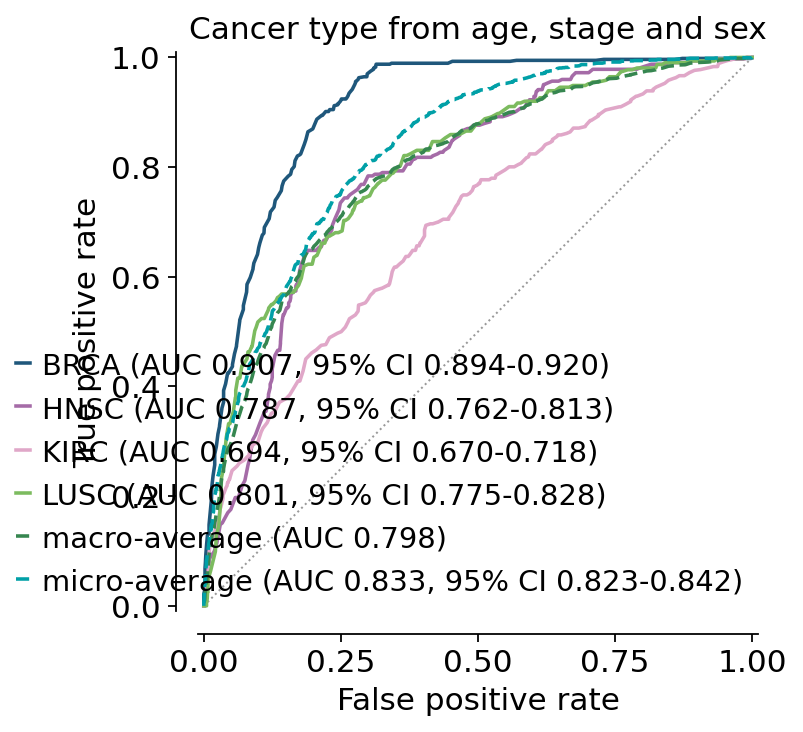
For a multi-class problem pass the probability matrix and the class names: one one-vs-rest curve per class, plus the macro and micro averages.
top = model_df["cancer type abbreviation"].value_counts().head(4).index.tolist()
subset = model_df[model_df["cancer type abbreviation"].isin(top)]
Xc = pd.get_dummies(subset[["age_at_initial_pathologic_diagnosis", "stage",
                            "gender"]], drop_first=True).astype(float)
yc = subset["cancer type abbreviation"].to_numpy()
multi = LogisticRegression(max_iter=3000).fit(Xc.to_numpy(), yc)
ax = ov.pl.roc(y_true=yc, y_score=multi.predict_proba(Xc.to_numpy()),
               score_names=multi.classes_, average="both", figsize=(4.6, 4.6),
               title="Cancer type from age, stage and sex")
plt.show()
6. Confusion matrices — ov.pl.confusion#
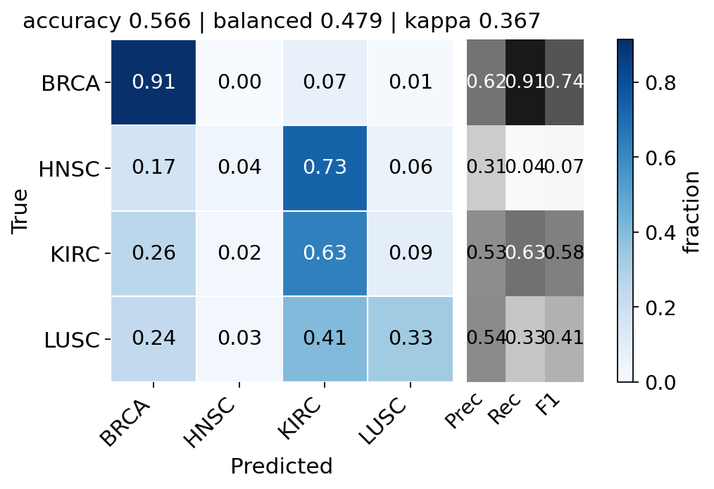
normalize='true' divides by the row total, so each cell is a recall and the
classes are comparable even though they are wildly imbalanced. metrics=True
adds the per-class precision / recall / F1 strip; the title carries accuracy,
balanced accuracy and Cohen’s kappa.
ax, cm = ov.pl.confusion(y_true=yc, y_pred=multi.predict(Xc.to_numpy()),
                         normalize="true", metrics=True, figsize=(6.4, 4.0),
                         return_stats=True)
plt.show()
cm["per_class"].round(3)
| precision | recall | f1 | support | |
|---|---|---|---|---|
| BRCA | 0.623 | 0.914 | 0.741 | 568 |
| HNSC | 0.308 | 0.037 | 0.066 | 324 |
| KIRC | 0.530 | 0.632 | 0.576 | 722 |
| LUSC | 0.536 | 0.332 | 0.410 | 313 |
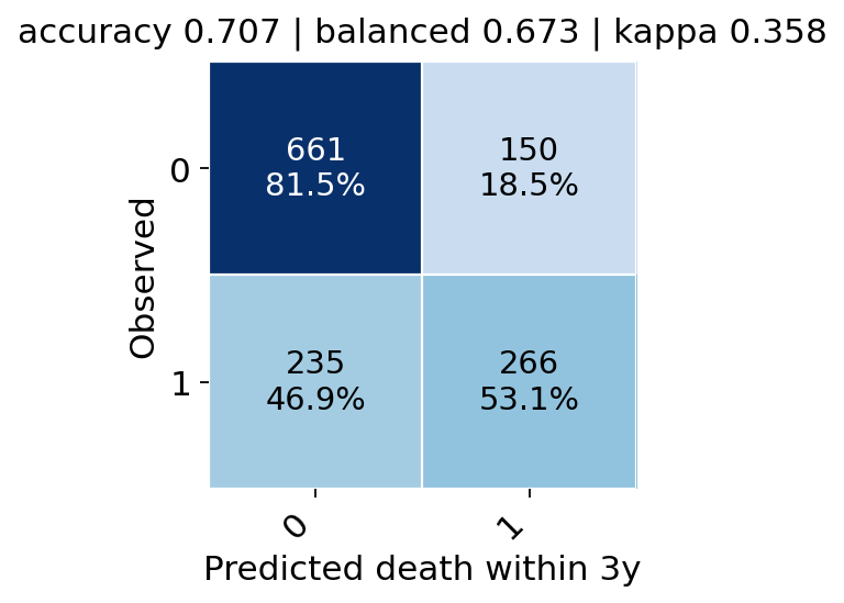
With counts_and_percent=True each cell shows the raw count above the
row percentage, which is what a supplementary table usually needs.
ax = ov.pl.confusion(y_true=y_te, y_pred=(scores["gradient boosting"] > 0.5).astype(int),
                     labels=[0, 1], counts_and_percent=True, colorbar=False,
                     figsize=(3.4, 3.2), xlabel="Predicted death within 3y",
                     ylabel="Observed")
plt.show()
7. Figure geometry — ov.pl.figure and ov.pl.multipanel#
Journals specify width in millimetres. matplotlib speaks inches. ov.pl.figure
takes mm, cm, inches or pixels — and the column widths of the common journals by
name, so figure('nature-single', 60) is exactly 89 mm wide.
fig = ov.pl.figure("nature-single", 60)
print("inches:", fig.get_size_inches())
print("mm    :", fig.get_size_inches() * 25.4)
plt.close(fig)
{k: ov.pl.JOURNAL_WIDTH_MM[k] for k in
 ["nature-single", "nature-double", "science-single", "cell-double"]}
inches: [3.50393701 2.36220472]
mm    : [89. 60.]
{'nature-single': 89.0,
 'nature-double': 183.0,
 'science-single': 55.0,
 'cell-double': 174.0}
fig = ov.pl.figure(1200, 800, units="px", dpi=150)
print("pixels:", fig.get_size_inches() * fig.dpi)
plt.close(fig)
pixels: [1200. 800.]
ov.pl.multipanel builds the grid, tags the panels in reading order and
returns the axes in a dict keyed by the tag — so a panel is referred to by the
letter that appears on it. A mosaic string works too, where repeated letters
span cells and . leaves a gap.
Here is a complete Figure 1 assembled from the analyses above, at Nature double-column width.
fig, axes = ov.pl.multipanel("AB\nCD", width="nature-double", height=150,
                             label="a")
ov.pl.survival(kirc, "months", "OS", "stage", ax=axes["A"], risk_table=False,
               fontsize=7, title="KIRC overall survival")
ov.pl.cumulative_incidence(lihc, "months", "cause", "stage", cause=1,
                           ax=axes["B"], fontsize=7, title="LIHC cancer death")
ov.pl.roc(y_true=y_te, y_score=scores, ax=axes["C"], fontsize=7, ci=None)
ov.pl.forest(hr.tail(8), "HR", se="se", label="cancer", log_scale=True,
             ax=axes["D"], fontsize=7, annotate=False,
             xlabel="HR, stage III-IV vs I-II")
plt.show()

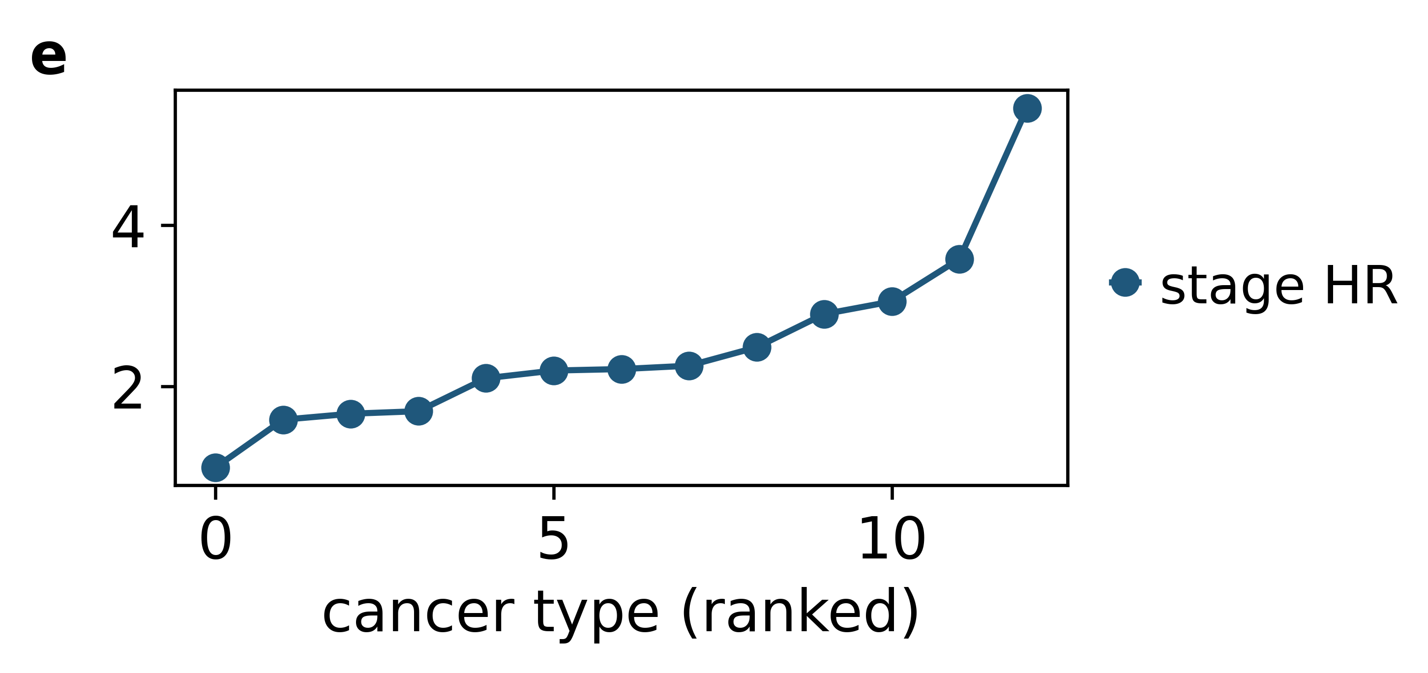
ov.pl.add_panel_label places a tag by itself, offset from the axes
corner in points rather than axes fractions — so the same offset looks the
same on a 40 mm and a 180 mm panel. ov.pl.take_legend_out moves a legend
clear of the data.
fig, ax = ov.pl.figure(120, 55, axes=True)
ax.plot(hr["HR"].to_numpy(), "o-", label="stage HR")
ax.set_xlabel("cancer type (ranked)")
ov.pl.add_panel_label(ax, "e", dx=-26, dy=4)
ov.pl.take_legend_out(ax, loc="right")
plt.show()
8. Export — ov.pl.savefig#
Two defaults matter here. svg.fonttype='none' stops matplotlib converting
every glyph into a path, so the labels in the SVG are still text you can select
and retype in Illustrator or Inkscape. pdf.fonttype=42 embeds TrueType rather
than Type-3 fonts, which is what makes a PDF editable at all.
One call writes every format you need.
paths = ov.pl.savefig(fig, "figures/figure1", formats=["pdf", "svg", "png"],
                      dpi=600)
[os.path.basename(p) for p in paths]
Saved: figures/figure1.pdf, figures/figure1.svg, figures/figure1.png
['figure1.pdf', 'figure1.svg', 'figure1.png']
svg = open("figures/figure1.svg").read()
print("SVG contains <text> nodes :", "<text" in svg)
print("label is still a string   :", "cancer type (ranked)" in svg)
SVG contains <text> nodes : True
label is still a string   : True
If you prefer to keep using plt.savefig directly, flip the same
defaults globally once:
ov.pl.set_editable_text() # every later savefig keeps text as text
One caveat, and it is the price of editability: svg.fonttype='none' means the
SVG references the font by name instead of embedding outlines. Whoever opens
the file needs that font installed, or their viewer substitutes one. For a
camera-ready file that nobody will edit again, ov.pl.set_editable_text(False)
goes back to outlined glyphs, which always render identically.
Pass bbox_inches=None when a journal asks for a figure of an exact width —
the default 'tight' crops to the drawn content and will shave a millimetre or
two off the canvas you asked ov.pl.figure for.
9. Not tied to AnnData#
Everything above took a DataFrame. The same calls accept bare arrays, or an
AnnData — in which case .obs is read. All three give the same numbers.
import anndata

adata = anndata.AnnData(np.zeros((len(kirc), 1), dtype=np.float32),
                        obs=kirc.reset_index(drop=True))
_, from_adata = ov.pl.survival(adata, "months", "OS", "stage", return_stats=True)
_, from_frame = ov.pl.survival(kirc, "months", "OS", "stage", return_stats=True)
plt.close("all")
_, from_arrays = ov.pl.survival(time=kirc["months"].to_numpy(),
                                event=kirc["OS"].to_numpy(),
                                group=kirc["stage"].astype(str).to_numpy(),
                                return_stats=True)
plt.close("all")
for label, s in [("DataFrame", from_frame), ("arrays", from_arrays),
                 ("AnnData", from_adata)]:
    print(f"{label:<10} log-rank chi2 = {s['statistic']:.6f}, "
          f"HR = {s['hazard_ratio']:.6f}")
DataFrame  log-rank chi2 = 140.016106, HR = 0.279415
arrays     log-rank chi2 = 140.016106, HR = 0.279415
AnnData    log-rank chi2 = 140.016106, HR = 0.279415
10. The statistics without the picture#
Every figure above is drawn from a number that is available on its own. When what you need is the value for a table or a sentence, call the estimator directly — each returns a plain dict, so nothing has to be scraped back off an axes.
fit = ov.pl.kaplan_meier(kirc["months"], kirc["OS"])
lo, hi = fit["median_ci"]
print(f"median OS {fit['median']:.1f} months (95% CI {lo:.1f}-{hi:.1f}), "
      f"{fit['n_events']}/{fit['n']} events")
median OS 84.2 months (95% CI 74.1-93.0), 338/938 events
lr = ov.pl.logrank_test(kirc["months"], kirc["OS"], kirc["stage"],
                        groups=["Stage III-IV", "Stage I-II"])
print(f"log-rank chi2 = {lr['statistic']:.1f}, {ov.pl.format_pvalue(lr['pvalue'], 'value')}")
print("stars:", ov.pl.format_pvalue(lr["pvalue"]))
log-rank chi2 = 140.0, P = 2.6e-32
stars: ****
ov.pl.grays_test is the competing-risk counterpart, and it answers a
different question from a log-rank on the same data — the log-rank compares
cause-specific hazards, Gray’s compares the incidence curves you actually
plotted. On this cohort they agree; when the competing risk differs between
groups they need not.
gray = ov.pl.grays_test(lihc["months"], lihc["cause"], lihc["stage"], cause=1)
naive = ov.pl.logrank_test(lihc["months"], lihc["cause"] == 1, lihc["stage"])
print(f"Gray's test          chi2 = {gray['statistic']:6.2f}  P = {gray['pvalue']:.2e}")
print(f"cause-specific LR    chi2 = {naive['statistic']:6.2f}  P = {naive['pvalue']:.2e}")
Gray's test          chi2 =  24.18  P = 8.75e-07
cause-specific LR    chi2 =  28.45  P = 9.61e-08
auc = ov.pl.roc_auc_ci(y_te, scores["gradient boosting"])
print(f"AUC {auc['auc']:.3f} (DeLong 95% CI {auc['lower']:.3f}-{auc['upper']:.3f}), "
      f"SE {auc['se']:.4f}")
AUC 0.790 (DeLong 95% CI 0.766-0.814), SE 0.0123
pooled = ov.pl.meta_analysis(np.log(hr["HR"]), hr["se"], method="random")
print(f"pooled HR {np.exp(pooled['estimate']):.2f} "
      f"({np.exp(pooled['lower']):.2f}-{np.exp(pooled['upper']):.2f})")
print(f"Q = {pooled['Q']:.1f} (df {pooled['df']}), I2 = {100 * pooled['I2']:.0f}%, "
      f"tau2 = {pooled['tau2']:.3f}")
pooled HR 2.24 (1.84-2.74)
Q = 52.0 (df 12), I2 = 77%, tau2 = 0.098
And the export defaults can be set globally, for code that calls
plt.savefig directly rather than going through ov.pl.savefig.
previous = ov.pl.set_editable_text(True)
print({k: plt.rcParams[k] for k in ("svg.fonttype", "pdf.fonttype", "ps.fonttype")})
print("previous values:", previous)
{'svg.fonttype': 'none', 'pdf.fonttype': 42, 'ps.fonttype': 42}
previous values: {'svg.fonttype': 'none', 'pdf.fonttype': 42, 'ps.fonttype': 42}
Summary#
Task |
Call |
|---|---|
Survival by group, with everything a reviewer asks for |
|
Incidence when patients can die of something else |
|
Compare classifiers |
|
Where a classifier confuses classes |
|
Effect sizes across cohorts, pooled |
|
A canvas at a journal’s column width |
|
A labelled panel figure |
|
Export with editable text |
|
The estimators are also available on their own, without drawing anything:
ov.pl.kaplan_meier, ov.pl.logrank_test, ov.pl.aalen_johansen,
ov.pl.grays_test, ov.pl.roc_auc_ci and ov.pl.meta_analysis all return
plain dictionaries.