Trajectory Inference with Diffusion Map and PAGA#
This tutorial demonstrates an endocrine pancreas trajectory workflow based on Diffusion Map and PAGA. The analysis first uses diffusion geometry to describe gradual transitions on the cellular manifold, then uses PAGA to summarize the global branch topology.
Method background#
See the Scanpy diffusion pseudotime documentation and PAGA workflow for the underlying ideas.
import scanpy as sc
import matplotlib.pyplot as plt
import warnings
warnings.filterwarnings("ignore", category=FutureWarning)

import omicverse as ov
ov.plot_set(font_path='Arial')

%load_ext autoreload
%autoreload 2
🔬 Starting plot initialization...
Using already downloaded Arial font from: /var/folders/rv/3jnfbs0d6r7d0c5bfj7ft5k00000gn/T/omicverse_arial.ttf
Registered as: Arial
🧬 Detecting GPU devices…
✅ Apple Silicon MPS detected
    • [MPS] Apple Silicon GPU - Metal Performance Shaders available

   ____            _     _    __
  / __ \____ ___  (_)___| |  / /__  _____________
 / / / / __ `__ \/ / ___/ | / / _ \/ ___/ ___/ _ \
/ /_/ / / / / / / / /__ | |/ /  __/ /  (__  )  __/
\____/_/ /_/ /_/_/\___/ |___/\___/_/  /____/\___/

🔖 Version: 2.1.3rc1   📚 Tutorials: https://omicverse.readthedocs.io/
✅ plot_set complete.
adata = ov.datasets.pancreatic_endocrinogenesis()
⚠️ File ./data/endocrinogenesis_day15.h5ad already exists
 Loading data from ./data/endocrinogenesis_day15.h5ad
✅ Successfully loaded: 3696 cells × 27998 genes
adata = ov.pp.preprocess(adata, mode='shiftlog|pearson', n_HVGs=3000)
adata.raw = adata
adata = adata[:, adata.var.highly_variable_features]
ov.pp.scale(adata)
ov.pp.pca(adata, layer='scaled', n_pcs=50)
🔍 [2026-05-12 15:46:50] Running preprocessing in 'cpu' mode...
Begin robust gene identification
    After filtration, 17750/27998 genes are kept.
    Among 17750 genes, 16426 genes are robust.
✅ Robust gene identification completed successfully.
Begin size normalization: shiftlog and HVGs selection pearson

🔍 Count Normalization:
   Target sum: 500000.0
   Exclude highly expressed: True
   Max fraction threshold: 0.2
⚠️ Excluding 1 highly-expressed genes from normalization computation
   Excluded genes: ['Ghrl']

✅ Count Normalization Completed Successfully!
   ✓ Processed: 3,696 cells × 16,426 genes
   ✓ Runtime: 0.11s

🔍 Highly Variable Genes Selection (Experimental):
   Method: pearson_residuals
   Target genes: 3,000
   Theta (overdispersion): 100
✅ Experimental HVG Selection Completed Successfully!
   ✓ Selected: 3,000 highly variable genes out of 16,426 total (18.3%)
   ✓ Results added to AnnData object:
     • 'highly_variable': Boolean vector (adata.var)
     • 'highly_variable_rank': Float vector (adata.var)
     • 'highly_variable_nbatches': Int vector (adata.var)
     • 'highly_variable_intersection': Boolean vector (adata.var)
     • 'means': Float vector (adata.var)
     • 'variances': Float vector (adata.var)
     • 'residual_variances': Float vector (adata.var)
    Time to analyze data in cpu: 0.52 seconds.
✅ Preprocessing completed successfully.
    Added:
        'highly_variable_features', boolean vector (adata.var)
        'means', float vector (adata.var)
        'variances', float vector (adata.var)
        'residual_variances', float vector (adata.var)
        'counts', raw counts layer (adata.layers)
    End of size normalization: shiftlog and HVGs selection pearson

╭─ SUMMARY: preprocess ──────────────────────────────────────────────╮
│  Duration: 0.6316s                                                 │
│  Shape:    3,696 x 27,998 -> 3,696 x 16,426                        │
│                                                                    │
│  CHANGES DETECTED                                                  │
│  ────────────────                                                  │
│  ● VAR    │ ✚ highly_variable (bool)                               │
│           │ ✚ highly_variable_features (bool)                      │
│           │ ✚ highly_variable_rank (float)                         │
│           │ ✚ means (float)                                        │
│           │ ✚ n_cells (int)                                        │
│           │ ✚ percent_cells (float)                                │
│           │ ✚ residual_variances (float)                           │
│           │ ✚ robust (bool)                                        │
│           │ ✚ variances (float)                                    │
│                                                                    │
│  ● UNS    │ ✚ REFERENCE_MANU                                       │
│           │ ✚ _ov_provenance                                       │
│           │ ✚ history_log                                          │
│           │ ✚ hvg                                                  │
│           │ ✚ log1p                                                │
│           │ ✚ status                                               │
│           │ ✚ status_args                                          │
│                                                                    │
│  ● LAYERS │ ✚ counts (sparse matrix, 3696x16426)                   │
│                                                                    │
╰────────────────────────────────────────────────────────────────────╯
╭─ SUMMARY: scale ───────────────────────────────────────────────────╮
│  Duration: 0.3075s                                                 │
│  Shape:    3,696 x 3,000 (Unchanged)                               │
│                                                                    │
│  CHANGES DETECTED                                                  │
│  ────────────────                                                  │
│  ● LAYERS │ ✚ scaled (array, 3696x3000)                            │
│                                                                    │
╰────────────────────────────────────────────────────────────────────╯
computing PCA🔍
    with n_comps=50
   🖥️ Using sklearn PCA for CPU computation
   🖥️ sklearn PCA backend: CPU computation
   📊 PCA input data type: ArrayView, shape: (3696, 3000), dtype: float64
🔧 PCA solver used: covariance_eigh
    finished✅ (7.87s)

╭─ SUMMARY: pca ─────────────────────────────────────────────────────╮
│  Duration: 7.8698s                                                 │
│  Shape:    3,696 x 3,000 (Unchanged)                               │
│                                                                    │
│  CHANGES DETECTED                                                  │
│  ────────────────                                                  │
│  ● UNS    │ ✚ scaled|original|cum_sum_eigenvalues                  │
│           │ ✚ scaled|original|pca_var_ratios                       │
│                                                                    │
│  ● OBSM   │ ✚ scaled|original|X_pca (array, 3696x50)               │
│                                                                    │
╰────────────────────────────────────────────────────────────────────╯
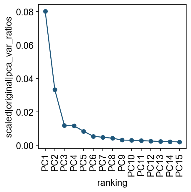
We first inspect how much variance is explained by each principal component. This gives a practical check for how many PCs to use when constructing the cell-neighbor graph.
ov.utils.plot_pca_variance_ratio(adata, n_pcs=15)
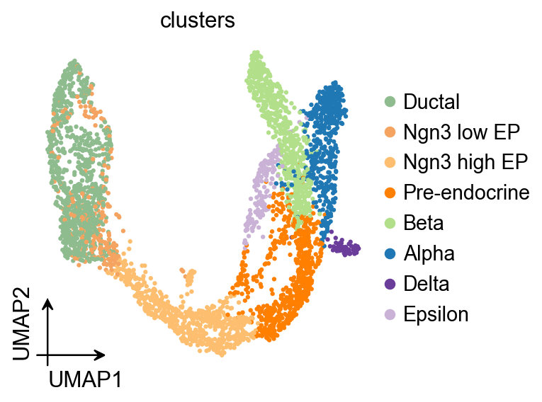
ov.pl.umap(
    adata,
    color='clusters'
)
X_umap converted to UMAP to visualize and saved to adata.obsm['UMAP']
if you want to use X_umap, please set convert=False
Diffusion Map#
Here we use ov.single.TrajInfer to construct the trajectory inference object.
Traj=ov.single.TrajInfer(
adata,
basis='X_umap',
groupby='clusters',
use_rep='scaled|original|X_pca',
n_comps=50,
)
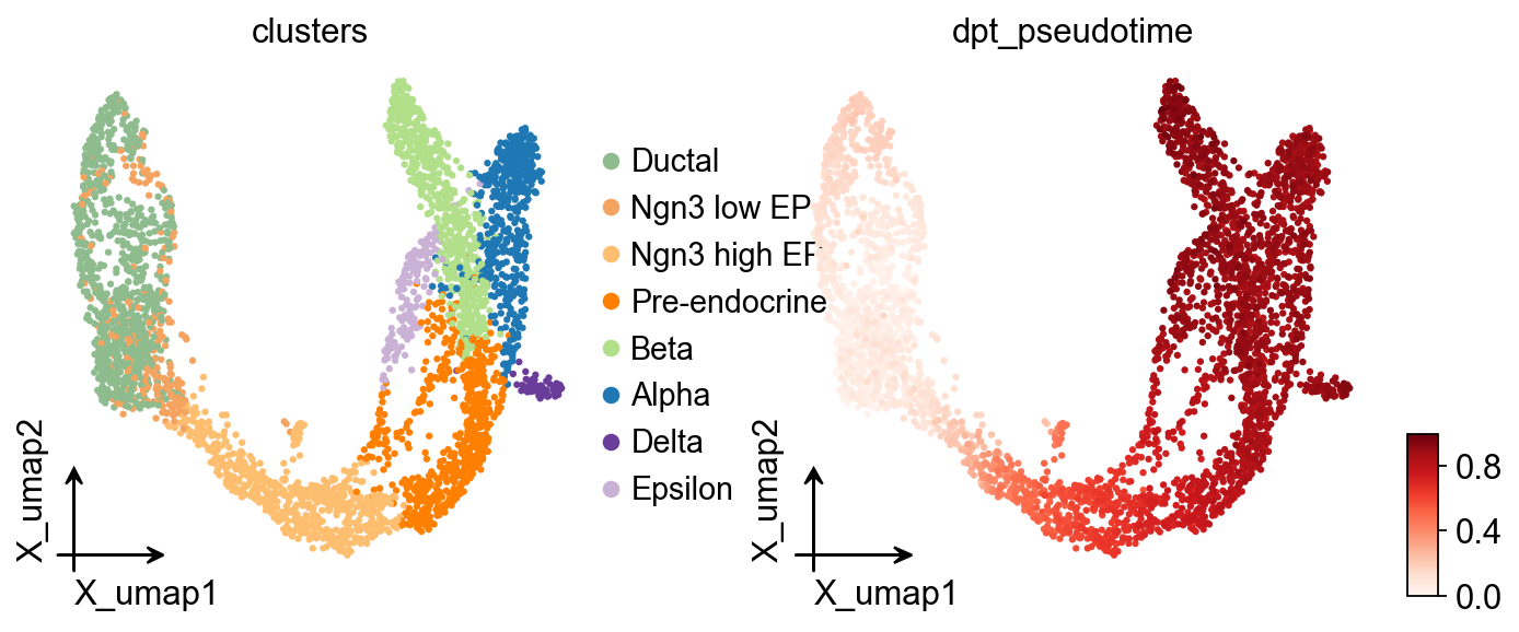
Traj.set_origin_cells('Ductal')
Traj.inference(method='diffusion_map')
ov.pl.embedding(
    adata,
    basis='X_umap',
    color=['clusters','dpt_pseudotime'],
    frameon='small',
    cmap='Reds'
)
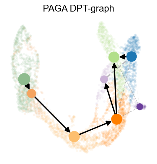
PAGA summarizes the data topology as a weighted graph, where edge weights represent connectivity between clusters. We further combine it with neighborhood direction information so the PAGA result is easier to interpret as a developmental trajectory.
ov.utils.cal_paga(
    adata,
    use_time_prior='dpt_pseudotime',
    vkey='paga',
    groups='clusters'
)
running PAGA using priors: ['dpt_pseudotime']
    finished
added
    'paga/connectivities', connectivities adjacency (adata.uns)
    'paga/connectivities_tree', connectivities subtree (adata.uns)
    'paga/transitions_confidence', velocity transitions (adata.uns)
ov.utils.plot_paga(
    adata,basis='umap',
    size=50,
    alpha=.1,
    title='PAGA DPT-graph',
    min_edge_width=2,
    node_size_scale=1.5,
    show=False,
    legend_loc=False
)
<Axes: title={'center': 'PAGA DPT-graph'}>
Branch-aware Pseudotime Stream Plot#
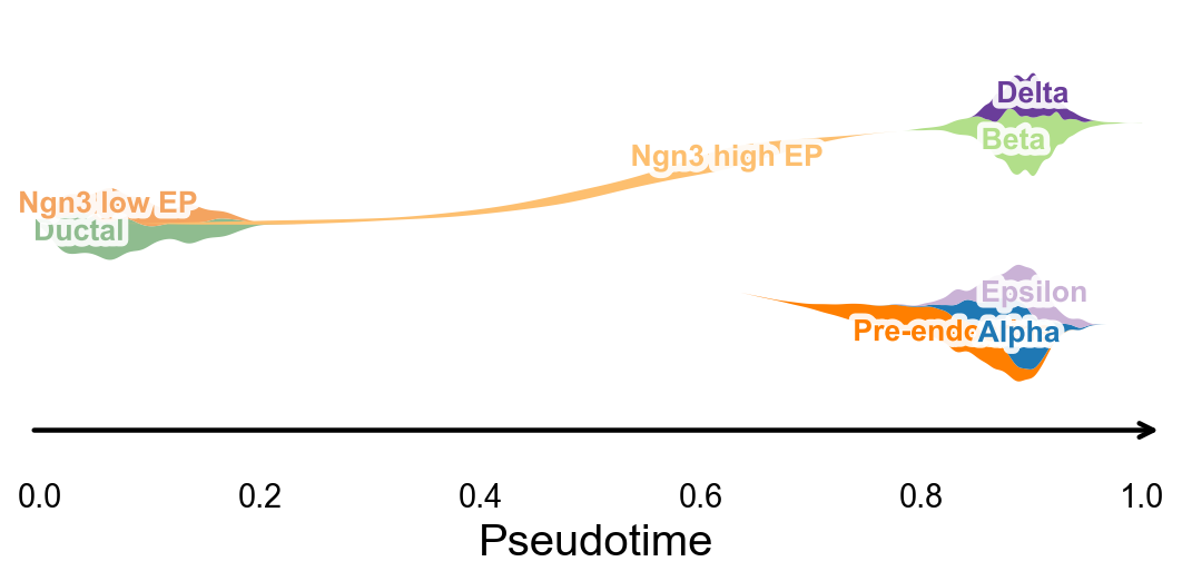
ov.pl.branch_streamplot only needs pseudotime and cell-state labels, so it can also be used for this trajectory method. Ribbon width represents where each cell type is enriched along pseudotime, and the branch center lines help reveal where endocrine fates separate.
fig, ax = ov.pl.branch_streamplot(
    adata,
    group_key='clusters',
    pseudotime_key='dpt_pseudotime',
    show=False,
)
plt.show()
Analyze DPT Pseudotime with dynamic_features / dynamic_trends#
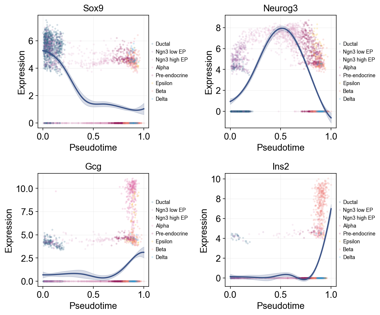
ov.single.dynamic_features can fit marker trends along dpt_pseudotime. We first draw global marker trends with raw points colored by cluster, then compare late Alpha and Beta branches to show branch-associated expression changes.
import numpy as np

dpt_trend_genes = ['Sox9', 'Neurog3', 'Fev', 'Gcg', 'Arx', 'Pax4', 'Ins2', 'Pdx1', 'Sst', 'Hhex']

diffusion_dyn = ov.single.dynamic_features(
    adata,
    genes=dpt_trend_genes,
    pseudotime='dpt_pseudotime',
    use_raw=adata.raw is not None,
    distribution='normal',
    link='identity',
    n_splines=8,
    store_raw=True,
    raw_obs_keys=['clusters'],
)
🔍 Dynamic feature analysis:
   Views: 1 | Features: 10
   Pseudotime: dpt_pseudotime
   Stored raw obs keys: ['clusters']
   Expression source: adata.raw
   GAM: normal-identity | splines=8
✅ Dynamic feature analysis completed!
   ✓ Successful fits: 10/10
   ✓ Fitted rows: 2000
   ✓ Raw observations stored: 36960
Single-line Global Trends#
Each gene is fitted with one global trend line, while raw points are colored by cell annotation. This view separates the overall pseudotime trend from the cell states contributing the observations.
ov.pl.dynamic_trends(
    diffusion_dyn,
    genes=['Sox9', 'Neurog3', 'Gcg', 'Ins2'],
    add_point=True,
    point_color_by='clusters',
    figsize=(5, 3.5),
    ncols=2,
    legend_loc='right margin',
    legend_fontsize=8,
)
plt.show()
🔍 Dynamic trend plotting:
   Features: 4 | Groups: 1
   compare_features=False | compare_groups=False
✅ Dynamic trend plotting completed!
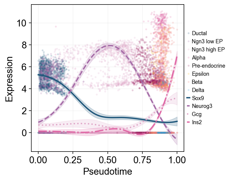
Multi-marker Trend Comparison#
Multiple marker curves are overlaid on the same pseudotime axis, making it easier to compare activation and decay order across programs.
ov.pl.dynamic_trends(
    diffusion_dyn,
    genes=['Sox9', 'Neurog3', 'Gcg', 'Ins2'],
    compare_features=True,
    add_point=True,
    point_color_by='clusters',
    line_style_by='features',
    figsize=(6, 4),
    linewidth=2,
    legend_loc='right margin',
    legend_fontsize=8,
)
plt.show()
🔍 Dynamic trend plotting:
   Features: 4 | Groups: 1
   compare_features=True | compare_groups=False
✅ Dynamic trend plotting completed!
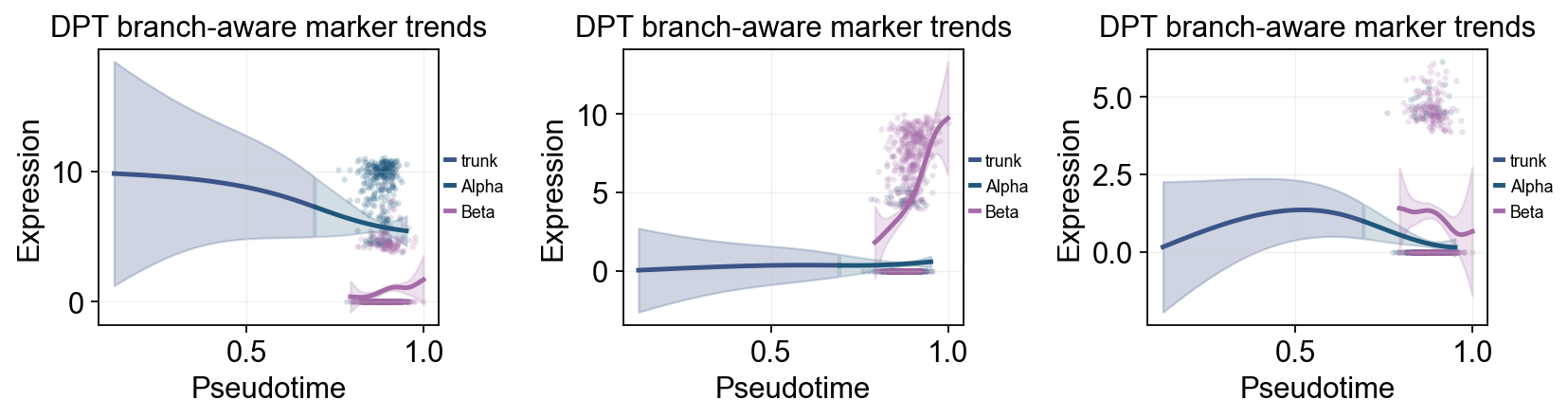
branch_clusters = ['Alpha', 'Beta']
split_mask = adata.obs['clusters'].astype(str).isin(['Ngn3 high EP', 'Pre-endocrine'])

diffusion_branch_dyn = ov.single.dynamic_features(
    adata,
    genes=['Gcg', 'Ins2', 'Pax4', 'Sox9'],
    pseudotime='dpt_pseudotime',
    groupby='clusters',
    groups=branch_clusters,
    use_raw=adata.raw is not None,
    distribution='normal',
    link='identity',
    n_splines=8,
    store_raw=True,
)
split_time = float(np.nanmedian(adata.obs.loc[split_mask, 'dpt_pseudotime'])) if split_mask.any() else float(np.nanmedian(adata.obs['dpt_pseudotime']))
🔍 Dynamic feature analysis:
   Views: 2 | Features: 4
   Pseudotime: dpt_pseudotime
   Grouping: clusters
   Expression source: adata.raw
   GAM: normal-identity | splines=8
✅ Dynamic feature analysis completed!
   ✓ Successful fits: 8/8
   ✓ Fitted rows: 1600
   ✓ Raw observations stored: 4288
ov.pl.dynamic_trends(
    diffusion_branch_dyn,
    genes=['Gcg', 'Ins2', 'Pax4'],
    compare_groups=True,
    split_time=split_time,
    shared_trunk=True,
    add_point=True,
    point_color_by='group',
    figsize=(4.2, 3),
    ncols=3,
    linewidth=2.2,
    legend_loc='right margin',
    legend_fontsize=8,
    title='DPT branch-aware marker trends',
)
plt.show()
🔍 Dynamic trend plotting:
   Features: 3 | Groups: 2
   compare_features=False | compare_groups=True
✅ Dynamic trend plotting completed!
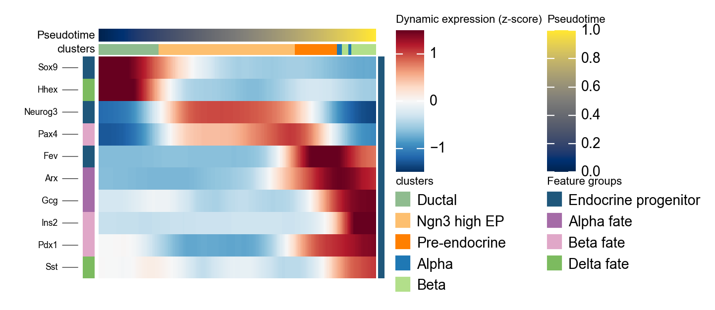
Summarize DPT Marker Programs with dynamic_heatmap#
ov.pl.dynamic_heatmap compresses grouped marker genes into a pseudotime-ordered heatmap. Here it is used to check whether progenitor and endocrine fate markers turn on in the order suggested by the stream plot.
dpt_marker = {
    'Endocrine progenitor': ['Sox9', 'Neurog3', 'Fev'],
    'Alpha fate': ['Gcg', 'Arx'],
    'Beta fate': ['Pax4', 'Ins2', 'Pdx1'],
    'Delta fate': ['Sst', 'Hhex'],
}

g = ov.pl.dynamic_heatmap(
    adata,
    var_names=dpt_marker,
    pseudotime='dpt_pseudotime',
    use_raw=adata.raw is not None,
    use_cell_columns=False,
    cell_annotation='clusters',
    cell_bins=180,
    smooth_window=17,
    fitted_window=31,
    figsize=(5, 4),
    standard_scale='var',
    cmap='RdBu_r',
    use_fitted=True,
    border=False,
    show=False,
)
🔍 Dynamic heatmap:
Candidate features: 10
   Pseudotime: dpt_pseudotime
   Cell annotation: clusters
   use_fitted=True | cell_bins=180 | cmap=RdBu_r
✅ Dynamic heatmap completed!
   ✓ Matrix shape: 10 features × 171 columns